Product badging, notifications, and overlays for eCommerce - get it right once and for all!
Product badging, notifications, and overlays for eCommerce - get it right once and for all!
You want to communicate with your shoppers in the most relevant way. Draw attention to your products. Most likely, you already are, or are looking to, leveraging product badges, notifications, and overlays to achieve this.
However, are you showing them to the right person at the right time? Are these messages increasing your CTR or CR rates? Can you track the data they generate?
What about reusing this data omnichannel?
If you can answer these questions with a resounding YES, then you’re on the right path to personalization and customer-centric retailing.
It doesn’t matter whether you have a refined internal CRO strategy or you’re working with personalization tools on-site. You’ll still need to learn the ins and outs of product badging, notifications, and overlays.
With years of experience leveraging messages across multiple retailer’s webshops, we want to centralize everything we’ve learned to help you make the most out of your digital merchandising and product discovery.
This go-to guide will:
Regardless of your digital maturity - A/B testing, segmentation, personalization - here’s the only guide you need for product badging, notifications, and overlays.
Product badging is the use of labels on a product image to highlight something that is special about the product. The label will either show information, like a product’s attributes and benefits, or have a behavioral principle nudge to trigger shopper click-behavior.
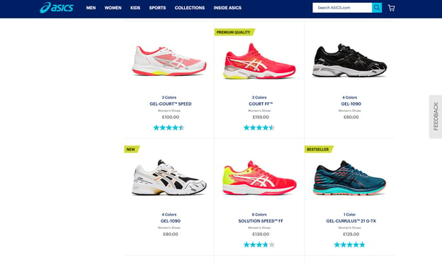
Product badges on the product lister page (PLP) are especially important for drawing attention to certain products. When a shopper is browsing a PLP, they’re at the point in their decision-making journeys where they need that extra nudge to single out certain products.
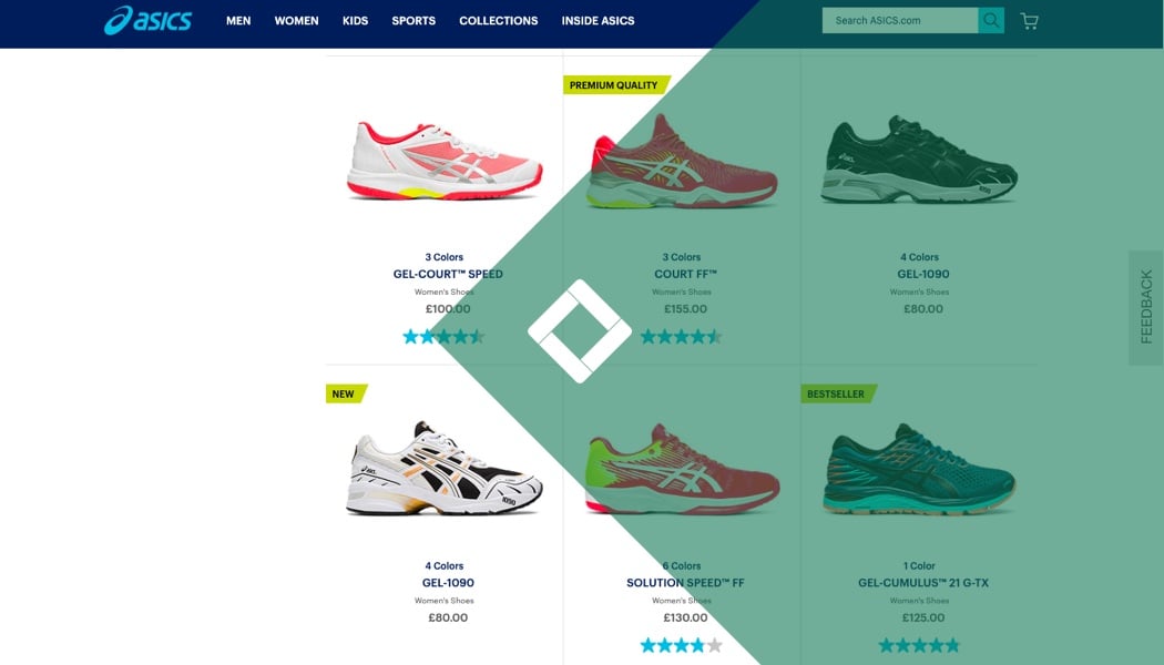
On ASICS’ PLP you see three different product badges:
Many product badges leverage one of Cialdini’s behavioral (ie., psychological) principles. Things like Authority, the Endowment Effect, Novelty, Social Proof, or Scarcity. These are based on human biases that appeal to our subconscious desires, needs, and goals.
“Product badges can be used to draw attention to products that speak to the shopper’s shopping preferences, goals, or ways of self-expression.” -Janelle de Weerd, Head of Growth at Crobox
Product badges on the PLP seek to draw attention, drive behavior, and help your shoppers make quicker decisions. They’re merchandising gold from both a UX and psychology perspective because they optimize your PDP design whilst helping your customers make better purchase decisions.
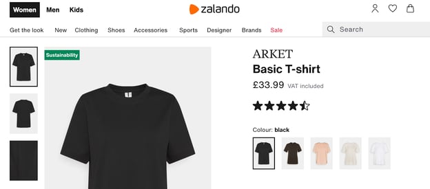
Once your customers have clicked from your PLP to the product detail page (PDP), they expect consistent messaging. Meaning, if you have a product badge on the PLP, make sure it’s sticky and carries through to the PDP.
Take Zalando’s “Sustainability” badge. Eco-conscious badges may require more information, especially for shoppers who are serious about the environmental impact of their behavior. Zalando takes their product badging one step further by putting a section describing the badge in their product details.
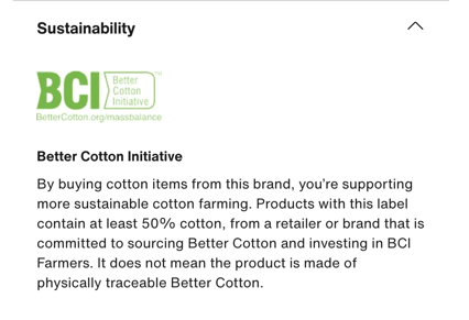
Incidentally, they leverage another badge “BCI” to foster trust in their environmental ethos. We’ll talk about trust badges later on.
Badges based on behavioral principles like Social Proof or Scarcity are more intrinsic. They tap into psychological biases to appeal to individuals. Unlike attributes or USPs, which reveal rational reasons why someone would buy one thing over another, behavioral nudges reveal glimpses into your shopper’s mindset.
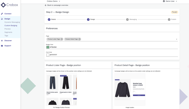
Crobox’s Custom Badging allows you to publish badges instantly to your site. You can create product and audience segments as well as support multi-regional campaigns with straightforward translation options On top of that we track the performance of all your badges so you know which messages have the greatest impact on your metrics of choice (e.g., CTR, CR, add-to-cart).
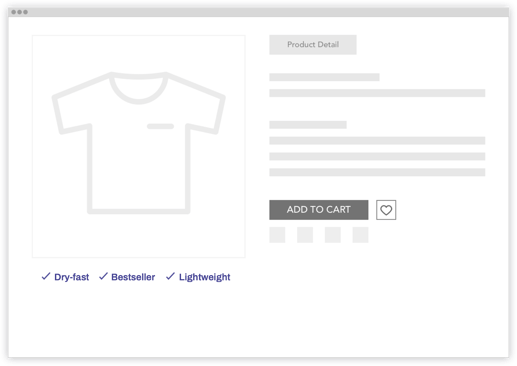
As was mentioned above, when a shopper lands on the PDP they’re generally looking for more product information. Product USPs show the features, characteristics, or special attributes of your product in a way that’s easy to digest and grabs attention.
For example, Crobox Dynamic Messaging tests different copy-variants of USPs to see which attribute appeals to which customers.
We do this by leveraging AI to track behavioral data. Our AI learns from the shopper’s context and then shows them the best message that will appeal to their shopping goals.
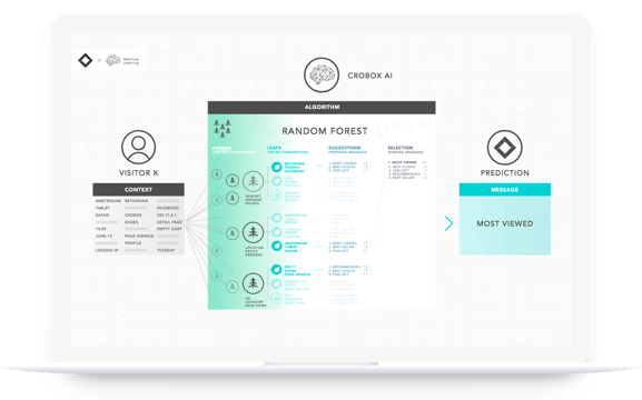
Crobox AI shows the right message at the right time based on a random forest learning technique. For more, read about Dynamic Messaging.
For example, when browsing IKEA, I’ve clicked on environmentally friendly products before. Which means the message “Sustainable” is guaranteed to be shown to be again since it’s already proved to influence my engagement with the product.
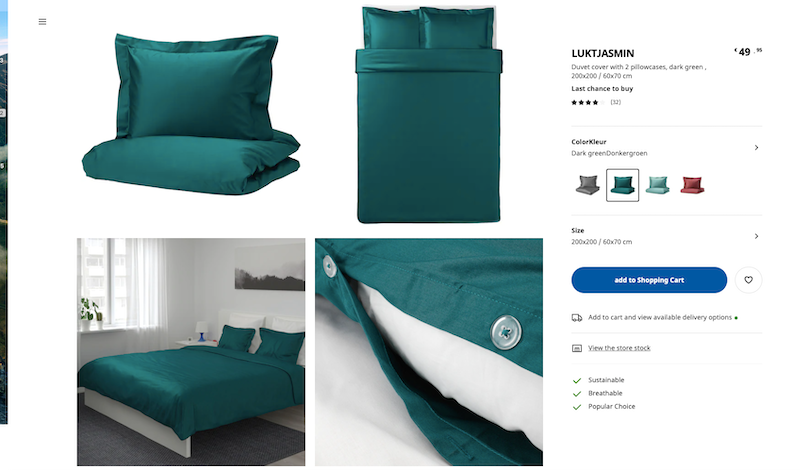
Optimizing USPs with AI is one step towards personalization maturity. But you can start small, by A/B testing icons or having static badges. In fact, Crobox’s Custom Badging feature is a do-it-yourself badge where you have the power to choose what message to show on what product.
Many attributes get lost in your descriptions, but by showing product USP badges you can begin to highlight what’s special about your products, whether it’s made with recycled materials, is durable, or has any kind of differentiating feature you wish to point out to your shoppers.
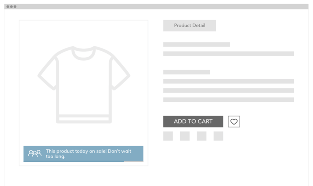
Product notifications are pop-ups that leverage long-form copy to drive purchase behavior. These messages are often more persuasive, appealing to the information-driven stage of the buyer’s journey.
When shoppers are considering a product on the PDP (e.g., reading the product descriptions carefully, choosing sizes) they are at the stage where their decision-making brain could use that extra boost.
However, using notifications as boosters must come with a warning: If you don’t personalize the message to the individual shopper, these can quickly be seen as annoying and intrusive.
YOU DON’T WANT AT SHOUT AT YOUR SHOPPERS.
Point taken - nobody likes being shouted at.
JC Penny’s notification is dishonest and called out as a Dark Pattern.
Your goal is to provide informative and dynamic messages that delight the shopper at this stage of the funnel. Notifications can only work if they:
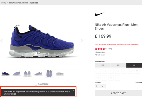
A good example of a product notification that works is from Nike. It leverages Social Proof by showing how many times the shoe was bought, and boosting its desirability with the copy “Get it while it’s hot!”.
Plus, the notification can be clicked away and is placed below the product so as not to obscure the product image.
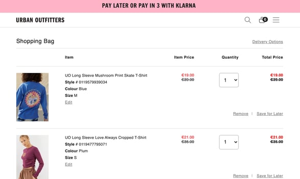
Another way to use notification boosters is on the cart page. This is the stage of the journey where shoppers are considering:
A notification that addresses one or all of these things will streamline the checkout process and make shoppers feel confident in the products they did add-to-cart. Which will, in turn, reduce abandoned carts.
Urban Outfitters offers easier payment options by allowing shoppers to pay with Klarna. And they show this as a notification banner to nudge shoppers at the right time. Facilitating payment is a good notification you can use on your cart page (which is why Amazon patented their one-click checkout).
So what about at checkout?
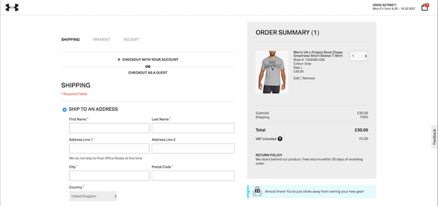
At checkout, nudges like Goal Gradients and trust symbols subconsciously make this final funnel stage feel easier to complete and less daunting. Like payment options, trust symbols tell the customer you’re looking after their private information.
But UA goes one step further, tapping into this decision-making phase by leveraging the Endowment Effect in their checkout notification. This behavioral principle makes shoppers feel a sense of ownership over items. The copy, “owning your own gear” instills this sense of possession, and nudges them to buy.
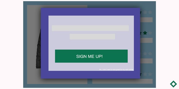
Interactive overlays present information to the customer in the form of a pop-up onscreen, usually triggered by the shopper’s on-site behavior and designed to encourage a specific action like sign-ups, reducing exit-intent, social sharing, discounts, brand information, or campaign awareness.
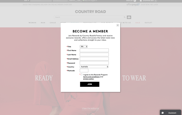
Country Road’s pop-up encourages shoppers to become members. In doing so, the customer gets exclusive rewards, offers, and access, messaging that leverages Exclusivity Scarcity.
This behavioral principle ties in well for memberships since there is already a desire for exclusivity. You can also leverage Unity, with copy like “Join the Club”, for example, to create a feeling of an ‘in-group’.
Psychological theories like belonging to an in-group and exclusivity are things we’ve explored in relation to luxury consumers. Read our Luxury Report for more insights into luxury behavior to ensure the right kind of messaging for these segments.
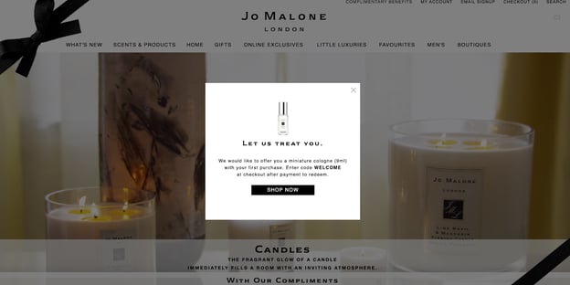
Exit-intent overlays are also really important to encourage users to stay on your site and boost conversions. Whereas you can configure your sign-up overlays to pop-up wherever you want, it’s a good idea to show exit-intent overlays when a customer goes to leave a site.
Jo Malone’s overlay is persuasive, offering a free gift if the shopper decides to shop and stay. Sophisticated overlay technology can capture when a user is likely to shop but not convert. In this case, an overlay offering a free sample is another good place and time to show the message.
But your most common overlays will help reduce exit-intent by offering discounts or special offers just as the user decides to leave. Jo Malone’s tactic also triggers Reciprocity. Shoppers like brands that offer something for free and may even reciprocate the offer with a purchase.
You’ve leveraged product badging, notifications, and overlays on your website. But before you sit back and relax, you still have to collect data to make the most from your personalization efforts.
Most badging strategies fail when it comes to reporting. Often your eCommerce or personalization tools will lack internal data and analytics reports.
Moreover, your GA or badging software will talk about overall uplifts. But you need to understand how people are interacting with your communication on a message level. Then you can begin to make your data actionable.
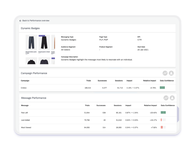
Whether you’re testing behavioral nudges, attributes, or USPs, there are certain steps that will take your messaging strategy to the next level without relying on AI. Let’s take a look at how to report on your product badging data.
Step #1: Set up your experiments.
The first thing you should do is set up A/B or multivariate tests to analyze which copy, design, or color drives behavior.
For example, testing Social Proof vs Scarcity messaging. Or blue vs. red badge colors. Or even badge placement, like below the image or on the top left of it.
Step #2: Choose your KPIs.
Define your KPIs in relation to the customer journey. Are you measuring success based on awareness, acquisition, or retention? You will have different data measurements for each funnel stage, which is essential to define for your overlays reporting.
For product badging, I recommend looking at CTR and CR uplifts because you can test your messages by what kind of copy drives click-behavior.
Step #3: Track on-site behavior.
If you’re tracking click-behavior, you can use tools like GA, HotJar, Kissmetrics, Crobox, and many more. You can even use a combination of tools, but you should have a centralized platform where you can track the uplifts of your experiments.
Step #3: Analyze behavioral data collected from your experiments.
This step is simple, but you need to get it right to make your data actionable. Analyze which messages increase or decrease your metrics.
Whatever your experimentation maturity, you should always test your messages against a control group. Meaning, a percentage of customers should see a message and a percentage should see no message.
Step #5: Segment your audience.
Now that you’ve tracked click-behavior on a message level, you can segment your audience based on which messages resonated the most with them.
Behavioral segmentation allows you to group customers based on how they’ve interacted with your badges.
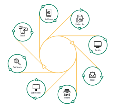
Step #6: Reuse high-performing messages.
If you know what messages (from your testing) appeal to who (customer segmentation), you can now do things like:
Step #7: Share data across departments.
Data-savvy retailers know that an un-siloed approach to data-sharing is the thing that defines a brand’s competitive advantage, especially in a market dominated by pure players.
For example, from your product USPs experiments, you can inform your manufacturing or creative departments what attributes drive behavior. If a badge showing “Recycled Material” resonates with the majority of online customers, then manufacturing and creative can implement data-driven ideas for new products or lines.
Crobox’s Product Profiles show the message performance on a product-level over time. It’s also a straightforward way to centralize all your product data like engagement, interest, performance and value indicators, so you can see how to promote or personalize your products based on their analytics.
Share this information in a digestible way across your departments to create a culture where everyone is learning from the customer, and optimizing accordingly.
If it’s every marketer’s job to grab attention, it’s every merchandiser’s job to do so in a relevant, timely, and engaging way.
We’ve covered product badges on the PLP, PDP, product USPs, notifications on the PDP, cart, and at checkout, and interactive overlays like sign-ups and exit-intents.
But don’t forget your reporting and analytics. Without this cherry on top, you can’t make the most from your personalization and really enhance your customer experiences across multiple channels.
At Crobox, we believe it’s the quality of data over the quantity. So make sure you’re monitoring the high-impact of your experiments. Take your personalization to the next level with Custom Badges, Dynamic Messages, AI, and product personalization by getting in touch!