What are dark patterns? This post reveals all.
How should I design my website to maximize my conversions? As an eCommerce professional, you probably ask yourself this every day.
So what do you do?
Do you change your CTA’s to trick your shoppers into clicking them? Do you hide steps in the buyer’s journey, forcing people towards checkout?
Do you sneak extra products into their carts? Make it impossible for your customers to log-out? Force them into agreeing to share their personal details without saying why?
I think we can all agree to a resounding: of course not.
Yet, some of these deliberate UI tricks are being used to drive short-term conversions on-site.
I say “short-term” because once your users become aware they are being manipulated, this quickly leads to abandoned carts, increased churn, and stunted CLV.
Your shoppers use mental shortcuts (heuristics) every day. When you trick your users or shoppers by exploiting these heuristics and laziness, this is a dark pattern.
This article will take you through:
In the end, I’ll provide you with a better way to maximize conversions without compromising your customers.
Dark patterns occur online when a user is tricked to perform a behavior they:
It’s as simple as that.
Dark patterns are deliberate user interface (UI) design choices that manipulate the individual into carrying out these reluctant behaviors.
Let’s put it this way - your shoppers have certain expectations. And if you do anything to harm that expectation, reverse it, or manipulate it, then you’re either creating a straight-up conversion killer or a dark pattern.
Imagine that you’re buying earrings. You enter a high-end jewelry store:

You expect to be greeted by a store assistant. You expect the assistant/clerk to have a robust knowledge of what they’re selling to guide you. You may even expect the store to have glass displays, cleanliness, luxury, classical music, you name it.
Now imagine that you’re shopping online for the same earrings.
The first thing that pops up on the jewelers’ webshop is a sales-y message. You can’t find the “x” so you are forced to click the CTA, which directs you to the most expensive earrings on the webshop.
Way out of budget.
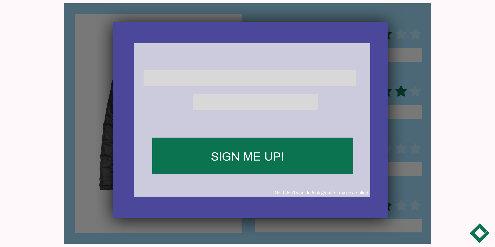
Imagine no “add-to-cart” buttons, but instead, you have to remove all the items you don’t want in order to save the item you do want to your cart.
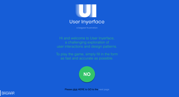
The most frustrating experiment in UI, contradicting all UX expectations. Play the game here.
And when you finally go to checkout, all the items you’ve spent time removing are instantly added to the final price!
Lastly, in order to pay by credit card, you have to fill in weird details about yourself like your hair color and work address, and the webshop doesn’t say why.
This is actually an extreme case of bad persuasive design. Most dark patterns on shopping websites will be more subtle than that, but no less frustrating.
In short, dark patterns confront expectations making behavior more difficult. More often than not, they leave the user feeling frustrated and tricked.
In September 2019, the US Senate introduced a bill to stop dark patterns. Aside from the legislature taking more precautions to curb online manipulation, your shoppers are also becoming more empowered as they browse online.
Common dark patterns are now easier to spot. If your shoppers come face to face with one on your website, this will harm the overall user experience online.
When the founder of https://www.darkpatterns.org/ Harry Bignull first coined the term “dark patterns” in 2010, he defined them as “dirty tricks to increase conversion rates”.
@darkpatterns Hall of Shame on twitter where people post examples they’ve encountered across the web.
Tricky usability guidelines, deceptive user interfaces, manipulative - dark patterns exploit consumer psychology to try and force negative behavior in line with the website’s interests.
“A dark pattern is when you expect something to happen based on your previous online experience, and then something entirely different happens.” - Joris Fonteijn, Chief Behavioral Officer at Crobox
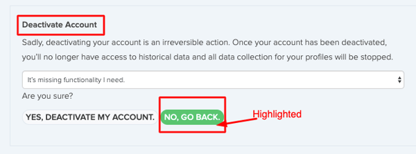
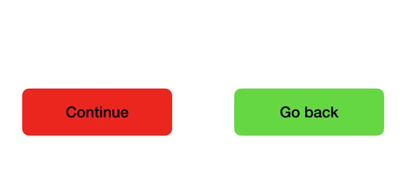
You would expect the green button to go forward into your journey, not the opposite. This is a dark pattern because it’s trying to trick the user into not deactivating the account.
Why is this important for eCommerce psychology?
If your webshop design doesn’t meet your shopper’s expectations or your copy is hard to decipher or manipulative, your CLV will be stunted. Your sales will decrease over time. And your customer-centric direction will be a thing of the past.
That’s because dark patterns exploit our base psychology.
As I said, humans are lazy.
The psychology behind heuristics is discussed in Kahneman’s Thinking, Fast and Slow, where he talks about how humans use Systems 1 and 2 to make decisions.
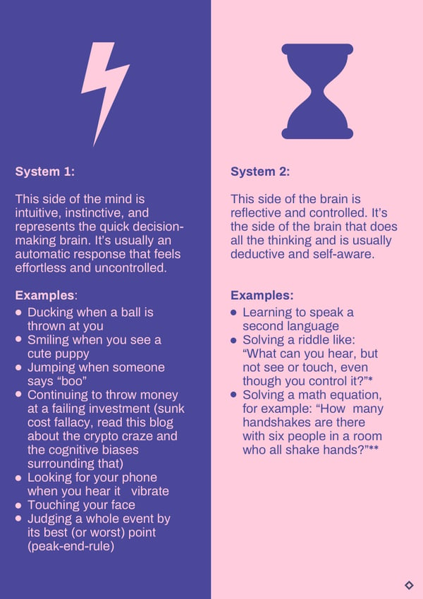
System 1 is the “lazy” part of the brain. It’s the automatic, reflexive part that influences fast-acting behavior like clicks on a webshop. Whereas System 2 is more contemplative and rationalizing.
System 1 operates on cognitive biases to facilitate these quick decisions. And dark patterns work by exploiting these cognitive biases.
“Dark patterns stem from hijacking people’s mental shortcuts. If someone is orchestrating your behavior and using this to your disadvantage, this will no doubt cost you money in the long run.” - Joris, CBO at Crobox
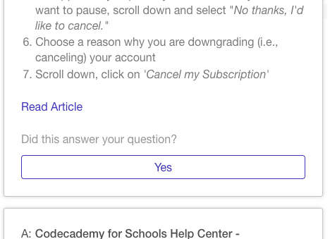
What if the article didn’t answer the question? I only have the choice to click “Yes”. Dark patterns remove choice, narrowing the consumer’s freedom.
Many dark patterns also remove the consumer’s ability to choose. They are built on fighting for the consumer’s attention in a way that limits the consumer’s freedom. Dark patterns are often placed when the user is experiencing cognitive overload. In eCommerce, this is in the small print, at the end of the customer journey, or in ads.
“A dark pattern is something you don’t want to do, purchase, or agree to. It also occurs when the user has deliberate, decreased ability to perform a behavior or complete a task.” - Patrick, Consumer Psychologist at Crobox
If you take Fogg’s Behavioral Model, where nudges fall within the optimal prompt point, dark patterns ultimately fall at the prompt failure point.
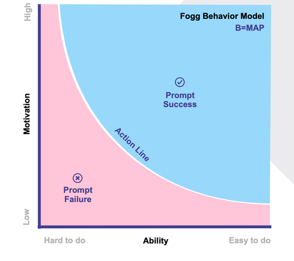
So while they might seem like persuasive shortcuts to increase conversions, dark patterns will actually cause more problems to your webshop in the long run. They will minimize ability and motivation, and leave your customers dissatisfied.
Let’s take a look at why this is the case.
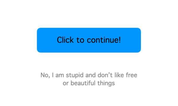
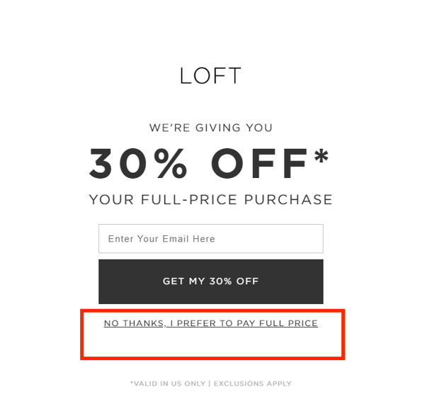
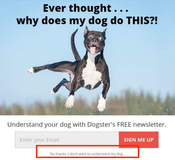
Ever seen something similar to this before? This is an extreme case of Confirmshaming. But it happens;
This is a dark pattern because it shames the customer into choosing an option that is desirable for the website, but not necessarily for the user.
“Paternalism” means guiding people in their best interest. “Libertarian” is preserving the user’s freedom of choice. Libertarian Paternalism is the foundation of nudge theory, and actually just a fancy word for “nudge”. Dark patterns contradict libertarian paternalism.
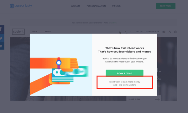
That’s the difference between a nudge and a dark pattern. Nudges create positive experiences, facilitate decision-making, and definitely don’t insult their target audience. Although smart notifications and exit-intent overlays are great nudges, the Confirmshaming copy is a dark pattern that will leave negative feelings.
What you should do instead:
A nod to its namesake, Privacy Zuckering is when a user agrees to something without acknowledging the full extent of their consent. This is usually in relation to data privacy.
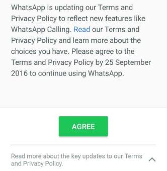
Whatsapp updates, for example, push you to agree to their Terms and Conditions without revealing all the extra data they will have access too when you click “agree”. It’s only when you click “read more” that you see everything you’re agreeing to share.
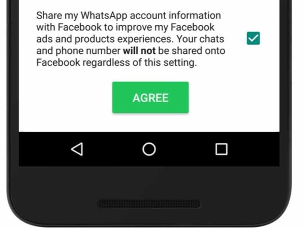
The copy is also deliberately tricky. We expect to tick something that’s in our best interest. But having a default tick coupled with the copy “will not”, and the “agree” button all at the same time is confusing.
“Making things deliberately confusing is also a dark pattern. If I want to agree to something by checking a box, that should be it. I shouldn’t also have to automatically agree to things I can’t see as that wasn’t part of the deal.” - Patrick, Consumer Psychologist at Crobox
What you should do instead:
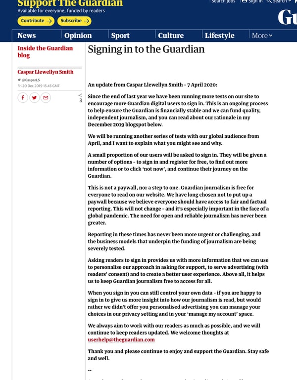
From The Guardian: why register, and what they are going to do with the reader’s data in terms of advertising. The letter is personal, informative, and there are clear areas on the website to direct the user towards this page.
“Asking for a consumer’s cookies should be a conversation. As a retailer, tell them why you need their cookies. Is it for tailored recommendations? Personalized ads? Do this to promote ease throughout the journey, instead of interrupting it.” - Joris, CBO at Crobox
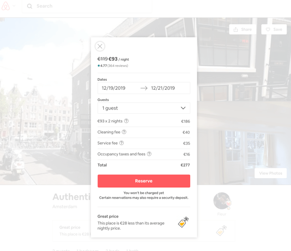
Airbnb could be accused of Hidden Costs because they almost double the initial price with these extra costs. However, this isn’t a dark pattern because the customer isn’t charged yet, and can see a clear breakdown of costs before completing their reservation. It’s not entirely hidden, but it is frustrating.
Another common dark pattern is Hidden Costs.
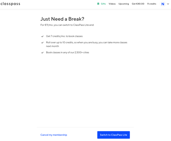
For example, ClassPass (sigh). I signed up for ClassPass thinking I could take a break anytime during my membership and resume whenever I felt like it.
Unfortunately, you can’t see the parameters of this membership-break without becoming a member first. Lack of information and costs that aren’t revealed at the start: these are dark patterns.
Instead, ClassPass offers to switch your membership to something lighter, but for that, you have to pay. If you want to cancel your membership, you have to chat with someone online instead of just clicking a button, making it much harder and time-consuming (a Roach Motel dark pattern we’ll see next).
This is sneaky because I wasn’t made aware of these steps beforehand. If you want your CX to be amazing, it’s key you disclose all costs at the very start of the journey, preferably before the consumer has paid anything at all.
What you should do instead:
“Stick to what people expect. Otherwise, people will need to move from System 1 to System 2 ways of thinking, which will deplete your customers.” - Joris, CBO at Crobox
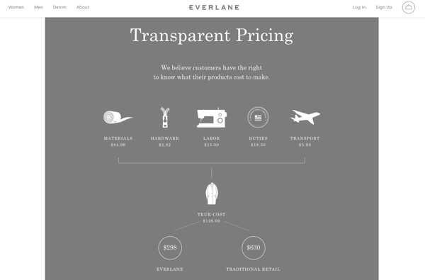
An extreme example of price transparency is from Everlane. Not only do they show the entire costs that go into making a product (in line with their sustainable supply chain), but they also let consumers choose prices on certain products. Brands that lean towards transparency and away from dark patterns will delight their customers.
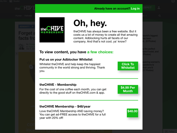 Give your customers the freedom to choose, with options that show clear costs. The plus side of the Chive’s approach is that they preserve their brand tone-of-voice whilst still being transparent.
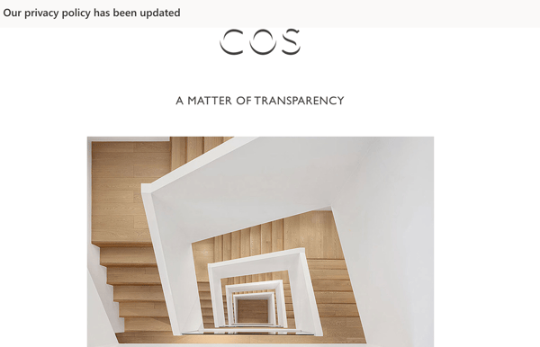 COS's email is transparent about their privacy updates, which is a good way to engage their customers in an honest way.
ClassPass actually shows two instances of dark patterns at work at different parts of the journey., The difficulty of getting out of a ClassPass subscription is called a Roach Motel dark pattern.
For example, canceling accounts on LinkedIn or Amazon. I mean, have you ever tried canceling your Amazon account?
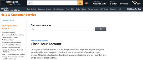
Unlike what you expect when canceling an account, you have to find "help & customer service" which is mostly hidden under a multitude of unnecessary options.
I felt a bit like a character from The Shining, trying to navigate a maze.
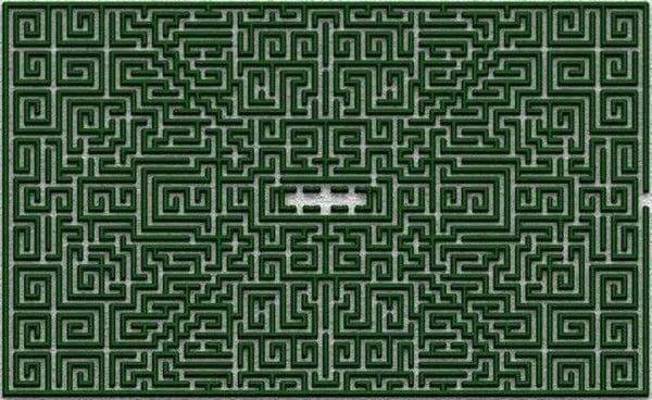
Not to compare Jeff Bezos to the crazed Jack Torrence of Stephen King’s imagination, but you get the idea.
What you should do instead:
These common dark patterns are easily unveiled online, and webshops are guilty of them.
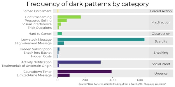
In fact, Princeton University crawled 11k shopping websites to reveal 1,818 instances of dark patterns. Which means these retailers are losing sales and damaging their customer-centricity.
That being said, it’s important that we look at more subtle instances of dark patterns so that you can avoid these at all costs.
There is a big difference between using persuasion to nudge users into making a positive decision with less stress and using untruthful pressure tactics.
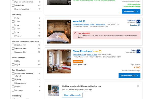
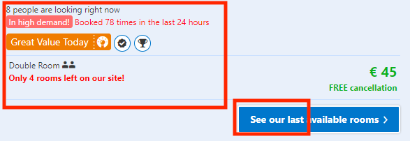
Booking.com has been called out multiple times for using Scarcity untruthfully to pressure their customers into buying. This is a dark pattern. It exploits the cognitive bias that people will respond to things that are scarce and thus manipulates the consumer.
If you want to use Urgency Scarcity, you need to make sure your copy is data-driven and truthful. I.e., If you have a message displaying limited stock, you should actually have limited stock.
“You can still make your designs more persuasive without making them dark patterns. Check your copy is true, adhere to internet standards, and stick to what people expect.” - Joris, CBO at Crobox
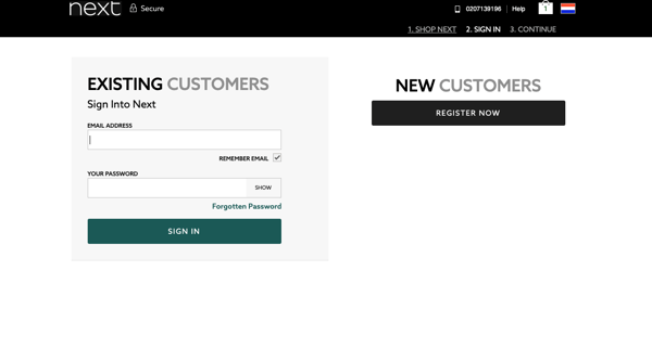
In some cases, forced action looks like obligatory sign-ins on webshops. This example above (Next) isn’t strictly a dark pattern but does interrupt the UX, becoming a blatant conversion killer.
What makes this kind of forced action a dark pattern is when the user is tricked into giving their personal data away in order to complete their purchase.
Instead, you should give your customers the choice: either register with you or check out as a guest.
“When you force something that someone doesn’t need or want, you are in essence taking someone’s freedom away. This is a psychological problem, and should be avoided at all costs” - Joris, CBO at Crobox.
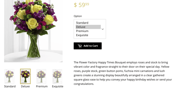
1-800 Flowers comes up often in Princeton’s website crawl. And what do they do especially well? They sneak in extra costs without alerting the shopper.
Another subtle dark pattern they use is to pre-select the “Deluxe” option on the PDP, which is more expensive than the standard price shown above. This capitalizes on our laziness to change the status quo (i.e., inertia bias).
It also sneaks a cost into the cart that is higher than the $59.99 shown, which is just plain misdirection. The price on the PDP should change according to which option is selected below.
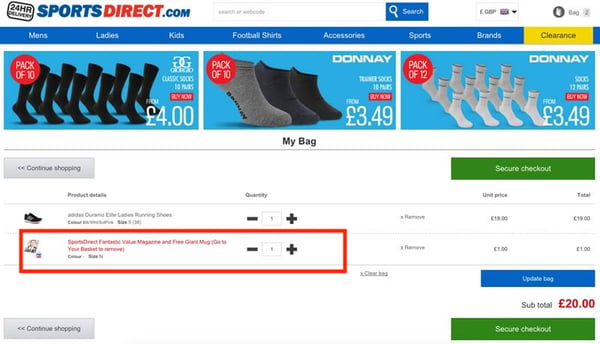 Don’t sneak extra products into your customers’ basket, even if they are at a low-price like this Sports Direct magazine. This causes friction, as the customer will have to remove the product, interrupting the buying journey.
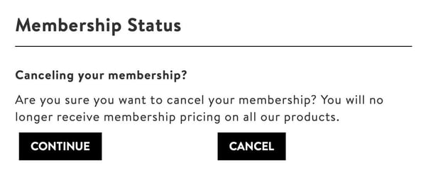 This copy is tricky. It’s not obvious which button I should click to cancel my membership. This is a dark pattern.
A lot of webshops will sneak in a subscription to a newsletter or email to keep re-targeting customers.
But remember: a dark pattern is forcing behavior that is harder to do. Sneaking subscriptions into your customers’ inboxes means they will have to spend time unsubscribing, causing friction.
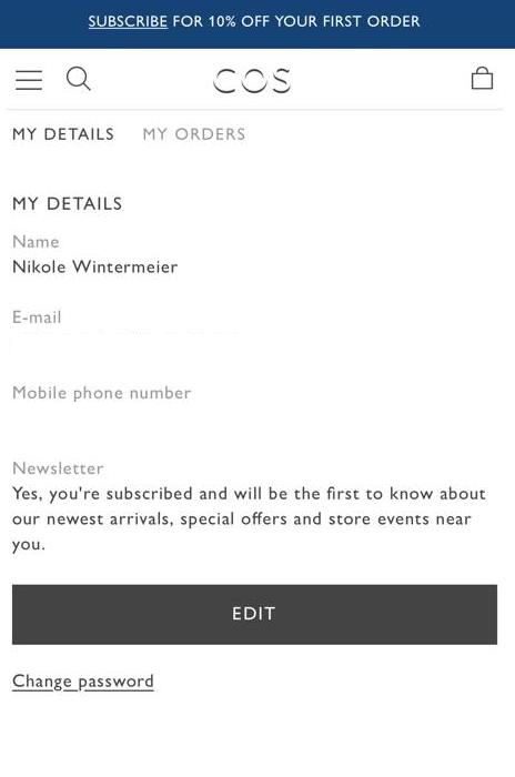
This example from COS isn’t strictly a dark pattern because the copy is clear and directional. However, I never had the option to opt-out of the newsletter. For people who don’t like to read, this opt-in was automatically selected, removing the freedom to choose.
This one above is a more extreme example. The user here has two options:
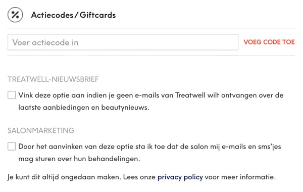
TREATWELL-NEWSLETTER
SALONMARKETING
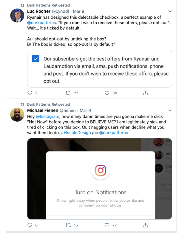
The second copy of the checkbox actually camouflages the first, which is a dark pattern. When thinking with System 1, our response would be to ignore the first option. Plus, ticking a box to not receive something is deceiving, and doesn’t meet our UX expectations.
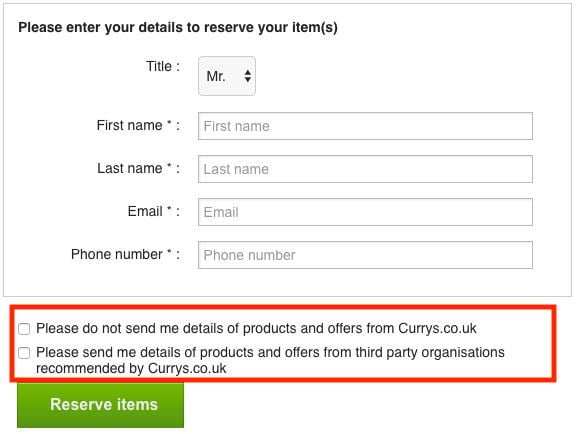 Double negatives like when you have to tick a box to not receive something.
Things like double negatives in your copy are dark patterns because they make things deliberately confusing.
Instead,
The thing is, the internet is continuously changing. UX and consumer behavior have a give-and-take relationship. The more dark patterns are used, the more the consumer becomes aware of them.
“There’s always a clear line between helping the consumer and tricking them. But this shade of darkness and its use will change over time, mostly due to increased awareness and the emergence of new technologies. When consumers realize they’re being used, they will find the path of least resistance and move towards the competition.” - Joris, CBO at Crobox
The question you should be asking is, how can I leverage psychology to provide the best customer experience? Not: how can I exploit psychology to increase conversions?
These are the questions and strategies that will separate the leading retailers from the laggards. It’s about optimizing your online offering based on your customers, not your conversions.
Dark patterns:
As an online retailer, it’s your responsibility to ensure your website is free of these “dirty little tricks”.
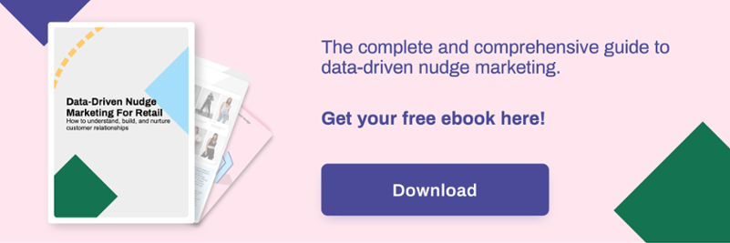
If you do want to leverage consumer psychology in an honest way, nudge marketing will help you remain relevant and persuasive, without resorting to dark patterns.
Read the ebook below for more about nudges, or get in touch for more examples and advice on dark patterns psychology.