Nudge marketing is a subtle way to help your customers make better decisions without hesitation.

Nudge marketing is a subtle way to help your customers make better decisions without hesitation.
You’ve worked hard to improve your click-through rates - running hundreds of A/B tests trying to find the perfect CTA color, product image, price framing. Yet, somehow, your (micro)conversion rates aren't increasing enough.
It’s a problem that binds all marketers working within the eCommerce space. And while there’s no silver bullet when it comes to cranking up those conversion rates, there are some valuable lessons from behavioral economics that you can apply. Specifically, through “Nudging.”When done right, nudge marketing can help drive purchase behavior omnichannel. Let me explain how you can get started.
Nudge marketing is the process of communicating marketing messages that encourage desired behavior by appealing to the psychology of the individual.
It is derived from Richard Thaler and Case Sunstein’s Nudging principle, which they describe in their book, Nudge, as:
“A nudge, as we will use the term, is any aspect of the choice architecture that alters people’s behavior in a predictable way without forbidding any options or significantly changing their economic incentives. To count as a mere nudge, the intervention must be easy and cheap to avoid.”
Put simply, nudging is the process of designing choices in ways that will appeal to the decision-maker, so the whole process of making the decision is easier.
One way of doing this in retail would be pointing out specific product characteristics that appeal to the shopper.
For example, let's say an electronics brand is promoting its smartwatch on their webshop.
They might put a label on the product image that states “waterproof” to promote the functional aspects of the watch. Alternatively, if they want to appeal to innovation shopper, they might put the tag “innovative tech” to capture their attention.
These subtle but effective messages help the decision-making process by pointing out specific characteristics that encourage action based on the shopper’s goals or personality tendencies. They act as a relevant behavior trigger that acts on an individual level.
Nudging is a term that was born from behavioral economics. For those of you who are not yet familiar with this, behavioral economics applies psychological insights of behavior to explain economic decision-making.
Behavioral economics is the new age way of understanding behavior in areas ranging from making healthy eating decisions and choosing health insurance to investment cycles and consumer buying patterns. It discards the traditional view of “rational decision-making” and embraces the irrationality of individuals.
Nudges build on the concept of heuristics, which are essentially short-cuts that we use to make decisions. Our brain strives to be as efficient as possible, so it uses visual and mental cues to help make decisions as automated as possible.
These short cuts happen subconsciously all the time. They help us to make daily, mundane choices like what to cook for dinner. They also help us to make choices in more important decisions like what kind of car to buy or which life insurance to purchase.
Some examples of heuristics are social proof messages that convey the popularity of a product. Or anchoring, which makes an amount look smaller when placed to a larger number. There are hundreds of heuristics out there, each having a different influence over individuals based on their past experiences and perspective.
For those looking to learn more about these, Thinking, Fast and Slow by Daniel Kahneman does a fantastic job at thoroughly introducing the concept.
Nudges leverage many heuristics so behavior can be subtly encouraged. They seek to appeal to individuals by making the decision feel more natural and automatic without forcing or manipulating.
Now that you have a better understanding of what nudging is and how it came to be, we can focus on what you need to get started.
First and foremost, having a thorough understanding of your target audience is a critical prerequisite. If you don’t know to whom you are marketing, you won’t be able to use the words and phrases that will appeal to them.
Get your hands dirty in the data. Go back to your customer personas to get a better idea of their interests, language, and personality. Dig deeper than just demographics by analyzing the psychographic profiles of your shoppers.
Once you know what your customers might be looking for, find common ground with the products you offer. Some standard psychological principles that can apply to any product offering are:
Next to these, you can also describe the more functional benefits if your products are organic, waterproof, original, or any other characteristic for which you know your shoppers are looking.
Take the different principles (e.g., social proof, authority, etc.) or product USPs and come up with as many copy variations you can. Perhaps even try putting the labels in different colors to keep the attention of your shoppers.
Then select a handful of products to bear the labels. Remember that you're trying to reduce Choice Overload. So, you don’t want to choose too many. Otherwise, the labels will become ineffective as they won’t limit the selection enough.
Once the content is ready, it’s time to start testing. You’re used to A/B testing by now, it’s time to get started with multivariate testing. Run various tests on the selected products to find which copy is the most effective in driving behavior. Or use AI to streamline this process.
As with any test, iteration is essential. Be sure to check in on the tests to see which are performing best.
This data can also provide insight into which of techniques resonate best with your audience. Are they more likely to respond to authority or social proof messages? You can even use these insights in your cross-channel communication.
At Crobox, we use all the data from our AI-experiments to create shopper profiles. These profiles can be used to segment campaigns based on the channel, source, country, amongst other dimensions. It’s a great way to create unique psychographics on your shoppers.
Are you looking to get started with nudges? Check out these examples from global retailers for some inspiration.
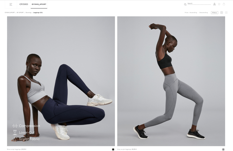
Oysho’s webshop doesn’t only have gorgeous design, they drive behavior in subtle ways that don’t get in the way of the shopper’s experience.
By highlighting the product characteristics, they help goal-oriented shoppers find the products they look for faster.
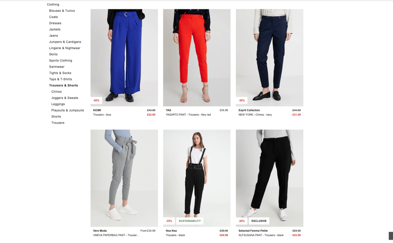
Zalando uses various labels to capture the attention of individuals. Next to discount percentages, they also bring attention to attributes such as a product's exclusivity (scarcity) or sustainability (noble edge effect).
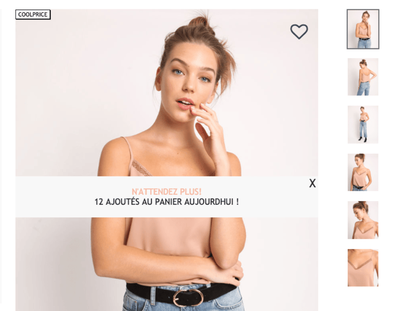
Capitalizing on social proof, Pimkie uses smart notifications (that can be closed) to let you know how many people have viewed the product. Helping to increase the certainty a person has in knowing they’re making the right choice.
Smart notifications remind the shopper of specific reasons they should buy the product. Any principle or functional benefit could be leveraged here.
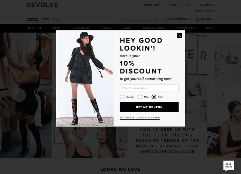
Visual cueing can be used to direct attention to text or other elements. Revolve uses the model’s gaze to highlight the discount being offered in the exit overlay.
Exit intent overlays trigger when people leave the product page. By promoting a discount, it increases the chance they stay on the page and eventually check out.
%20Overlay.png?width=800&name=Wishlist%20(on%20Exit)%20Overlay.png)
This exit overlay gives the person autonomy in their decision. Psychological theory finds that people want to remain autonomous in their decision, so being able to choose from various options (to check out or add to the bag) gives them that freedom. This is also known as the Hobson’s +1 Choice Effect.
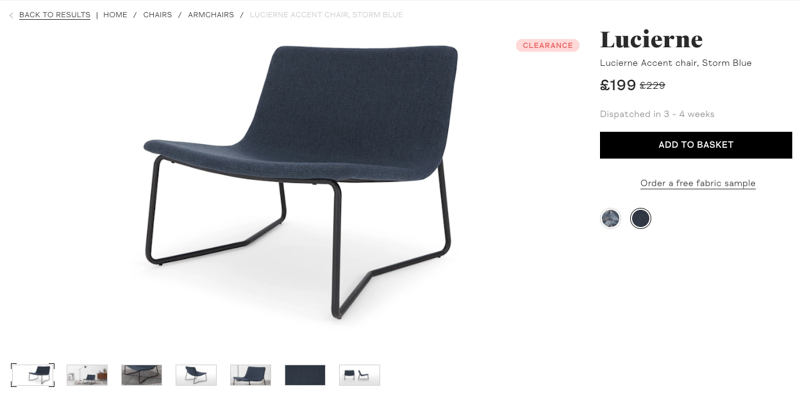
Anchoring is a well-known psychological pricing technique. It uses a higher price to “anchor” the individual on, making the discounted price seem even smaller.
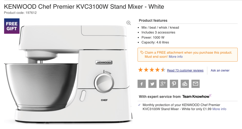
The reason that reviews are so effective in driving purchase behavior is well founded in psychological research. They play on the persuasion technique of social proof, which states that, in times of uncertainty, individuals will look towards the behavior of others to help them make decisions.
Reviews give more context and personal experience to products. Which is especially useful when it comes to buying from a new brand, webshop, or product category.
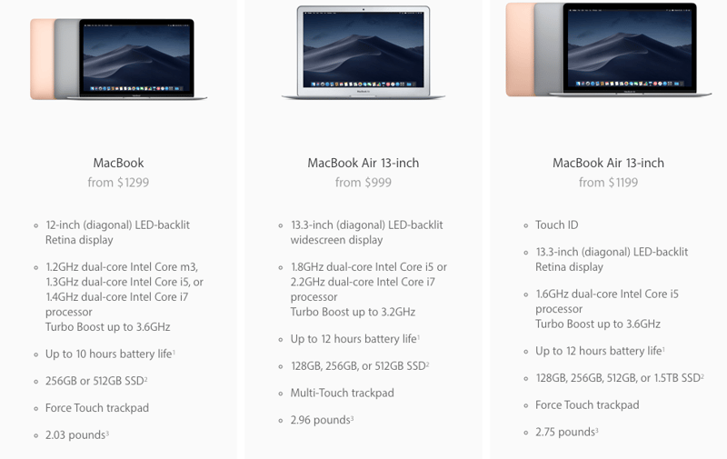
The decoy effect can be used to push the sales of a specific product by putting it next to similar products that aren’t perceived to be as good of a deal. This approach is generally used to make the most generally attractive option look even better (therein increasing satisfaction).
Although the decoy effect is generally used to push specific subscriptions by service providers, it can be used for products in comparison tables.

By auto-selecting a default option, you can reduce the number of choices a person has to make during their experience. The general rule of thumb is to select an option that is the most attractive to the user, and not trying to mislead them, so trust is upheld.
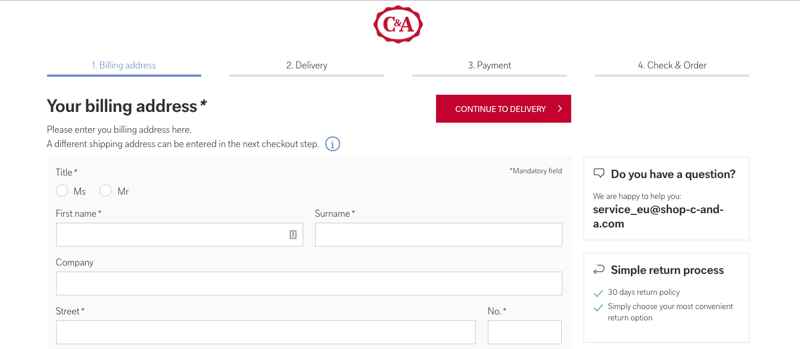
The Goal Gradient finds that people are more motivated by how far there is to go than how far they’ve come. As they get closer to the goal, their speed will quicken. You can implement this to make your checkout faster, which increases the likelihood of conversion success.
Using nudges not only helps direct your shoppers towards the buy button, but they can also make the shopping experience more pleasant. In today’s congested market, where customer experience rules, they can be the missing pieces to your webshop.
Coming out of this article, keep in mind: