Your PDP design guide from the brains of retail psychologists.
Your PDP design guide from the brains of retail psychologists.
As retail merchandisers, you already know that it’s not only about CRO.
Your webshops aren’t just about driving conversion to sell products. Optimizing eCommerce product pages isn’t as seemingly fool-proof as it used to be.
Instead, your product pages need to capture your webshop’s brand. You need to understand your customers’ psychology. And you need to know which design elements of your webshop are strong and which ones are weak.
Let’s zoom in on your product detail pages (PDPs). Arguably, these are the most important part of your website.
Why?
Because when your customers are looking at your PDPs, they are digesting information about a specific product in a particular way. In conversion optimization psychology, this means the PDP will determine your shopper’s buying behavior.
And, in turn, the best PDP designs will drive that behavior.
This article will serve as a merchandisers’ guide to creating the best PDP designs. With seven best practices in tow, our consumer psychologist has then analyzed two existing PDPs to show you why they’re great (and why they’re not).
So why is it important to be armed with best practices for PDP design?
We’ve already skimmed over your customer journeys. Remember your conversion funnel optimization?
The PDP is important because if your shoppers are looking at the details of a product, this usually puts them from awareness (on the PLP) to the consideration stage of the funnel.
Whereas your PLP is goal-driven, therefore, the PDP is information-driven. This is the customer journey phase that will determine your conversions, like add-to-cart or checkout.
So how do customers get to the PDP in the first place?
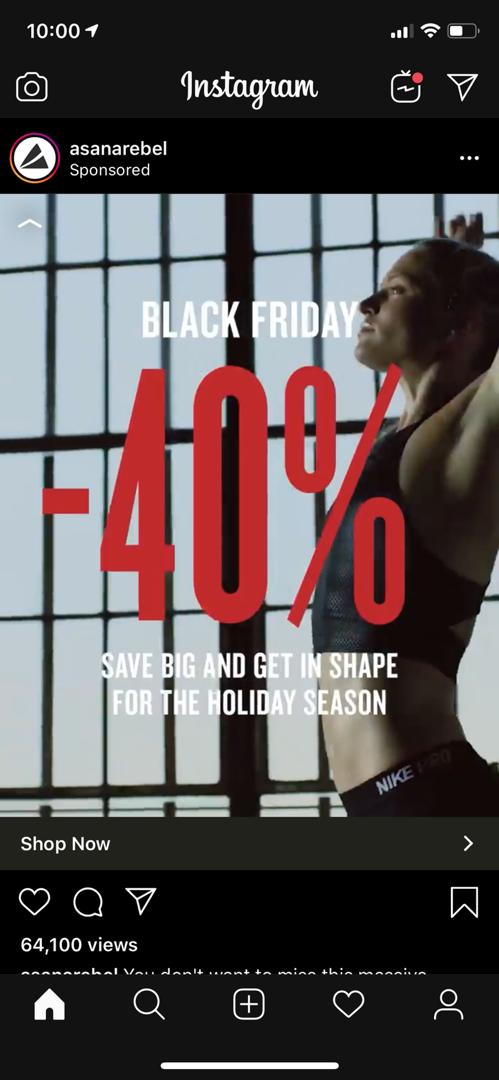
Instagram shoppable ad.
So if you take a look at your conversion funnel, the PDP is one of the last navigation pages in the search hierarchy.
At this point in their journeys, your customers are thinking:
In short, it’s important to continuously analyze and optimize your PDPs so that you can increase stickiness (preventing bounce) whilst collecting behavioral data in terms of what information appeals to your browsers, and what doesn’t.
However, the best PDPs go above and beyond these quick wins: They give shoppers the opportunity of a tailored in-store experience but with personalization functions they could only access in the digital world.
Don't worry, we'll show you loads of the best product detail pages to hammer this point in.
Now that we have a better idea of why strong PDPs are so important, let’s zoom in on the nine best practices to give you a better overview of what you should focus on.
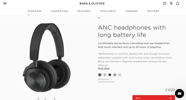
Bang and Olufsen’s high-resolution product video shows all angles of the product, close-up.
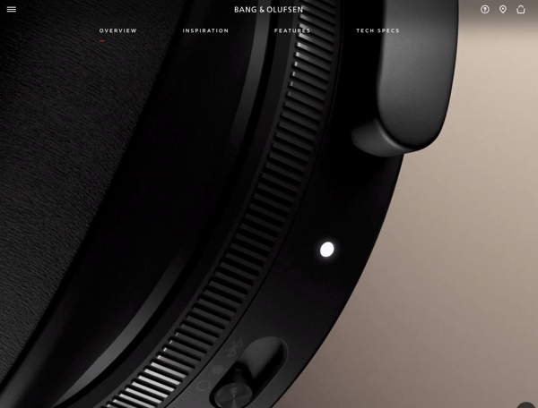
High-resolution product images are an absolute must-have in the PDP. If you want to really emulate that in-store experience, product images should be big, clear, and of the highest quality possible (without impacting your website load-times).
Webshop PDPs that go the extra mile will often have zoom, pinch, or enlarge buttons so that customers can see the product from all angles. If you can’t apply these functions to your images, consider showing a product video, or leveraging any kind of visual commerce.
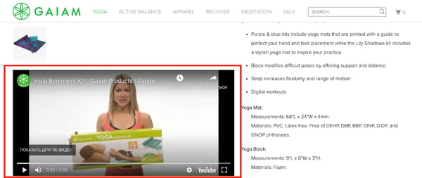
Gaiam shows a good example of visual commerce - an introduction on the product and a tutorial on how to use it.
To sum up some of the best practice tips for eCommerce product images:
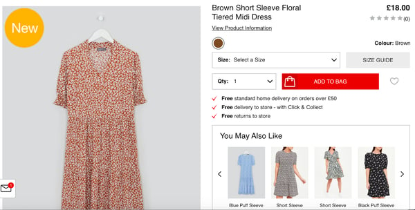
ASOS PDP
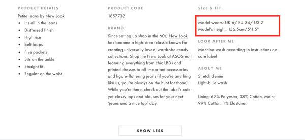
Remember that your shoppers want an in-store experience, online. The more the shopper can see the product in context (e.g., on a model), the fewer return rates you’ll have.
However, if you’re using models, you absolutely must show their size and height so your shoppers see more details about how the product fits.
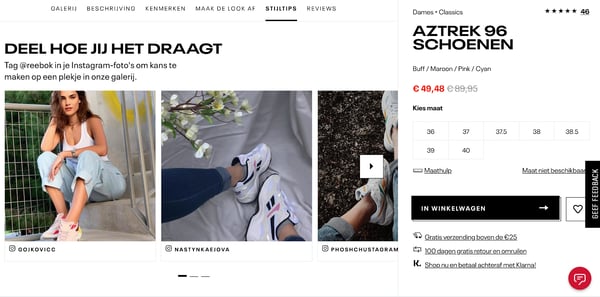
The more the product is shown in context on different people, the better. Reebok does this by including product lifestyle photos in their PDP.
Of course, how you show this information is just as important as what you show.
50% of shoppers will return an item they bought online if it doesn’t match the product description. So while it’s obvious advice that product information should be clear and detailed, it should also be truthful.
However, you shouldn’t stuff your PDPs with all the information you possibly can. Instead, it’s important to curate what information you want to show.
This means asking:
And optimizing your product information based on their psychographic profiles (interests, values, beliefs), demographics (including language and cultural nuances), and shopping intent (read more about shopping state personas here).
Understanding your customers is great, but you should also understand how your brand and products can draw attention, and reflect this in your product descriptions.
For example, you can optimize your product information based on industry keywords, and how you differentiate from your competitors.
Or, use Product Intelligence to test what product features and attributes drive click behavior on your webshop. You can leverage this product data to optimize your product taxonomies, but also your PDP descriptions.
Another obvious one - if customers can’t imagine, see, or understand how a product works, this will be a clear conversion killer, causing friction in your customer journeys.
Along with demonstrating the functionalities of your product on the PDP, you should also ask:
It’s really about bridging the gap between product and customer-centric, so you can optimize your descriptions in line with your brand tone-of-voice.
Also, don’t be afraid to use bullet points as I did above: This will break up the description and make it more readable.
Happy Wallets PDP
From a design perspective, the clearer the font and layout, the more likely you can turn browsers into buyers. The information on Happy Wallets’ webshop seems cluttered.
It also disrupts our expectations of a PDP layout - and anything that doesn't meet a user’s expectations will cause immediate resistance.
Moreover, your PDP should include information about:
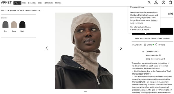
Arket’s shipping costs are expandable, if you hover over the text. This is nice visually, doesn't overcrowd the PDP, and still provides substantial information about the product.
Matalan has all the information packed in their PDP - which is actually something you don’t want. It clutters the product description.
One way you could relay the information they show is through nudges (overlays, notifications, or on the checkout page) which are more implicit cues, and more attractive to the eye.
For more about applying nudges on your PDP and general webshop, read our ebook at the end of this article.
Coupled with your technical product information, you should also make sure you have options that the shopper can choose from, without inflicting choice overload.
This means having color and size options as well as product recommendations to help customers explore related products. Making sure that these options are all in one place will help your customers find the products they are looking for faster.
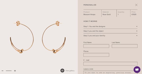
Of course, customization options (like engravings for jewelry) are also a good way to increase autonomy on your PDP.
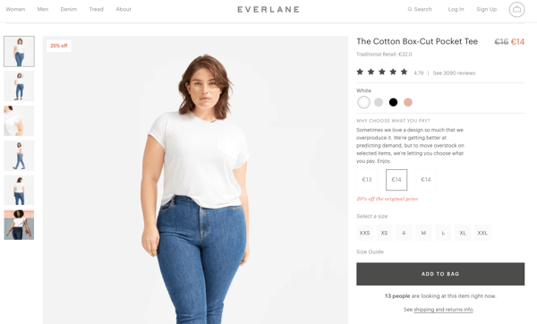
Everlane’s “Choose What You Pay” increases autonomy on the PDP by giving their customers all the information about what processes are behind each price. This feeds into their sustainability ethos and being transparent while giving customers enough options whilst not increasing choice overload.
Try experimenting with different autonomous options to see what drive behavior - is it a size-selector pop-up? Default options? In whatever way you choose to use these kinds of nudges, you should first test them on your visitors to see if they work.
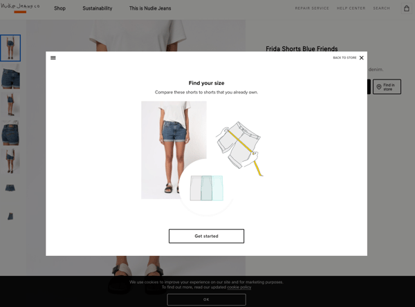
Nudie Jeans size selector pop-up.
Another best practice for the PDP is to have five to ten reviews on your PDP, with the option to show more reviews should the customer wish to explore more.
Reviews leverage Social Proof and are a good way to create user-generated hype around your products. Make sure to prompt or incentivize your customers to provide star ratings, so others can see their review and you can take an aggregated score.
And if you have bad reviews, respond to them. This is a good way to build trust in your shoppers.
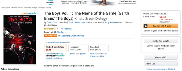
Amazon’s 1-click patent is the ultimate CTA to streamline behavior from the PDP to checkout.
CTAs are another indispensable element of your PDP. Remember: your customers are in the consideration phase of their journey, and a CTA button will facilitate their decision-making.
Strong CTAs aren’t only attractive in their design, they should have compelling copy that will make customer’s click on them.
CTAs should draw attention, and nudge people towards a conversion goal.
(If you’re targeting luxury buyers, your CTA copy should read “Explore”, “Discover”, rather than “Buy Now”. This is advice from our research on luxury consumer psychology, with more to come in our following Luxury Report).
Depending on your target audience, your CTAs could be dynamic (you can A/B test the copy). At the very least, your CTAs should be localized to the language and culture of your audience. .
We could go into detail about psychological marketing, but let’s keep it brief for the purposes of this eighth best practice.
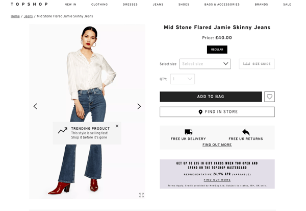
Top Shop using Social Proof (“Trending”) and Scarcity (“selling fast”) messaging and an interactive overlay message as a nudge.
Optimizing your PDP with psychology is simple in practice, but dense in theory. For example, you can leverage Scarcity in your copy, like “Limited Edition” or “Low in stock”. Scarcity messaging creates a sense of urgency to make products more appealing to your shoppers.
But used poorly, fostering urgency on the PDP may cause resistance. You want to be truthful in your Scarcity messaging, otherwise, this becomes a Dark Pattern.
This Scarcity timer is false, and thus a Dark Pattern.
Price anchoring is another psychological principle that you’ve probably already used. But it’s also a cognitive bias where we use “existing information as a baseline for our new judgments and decisions” (Andrews, Van Baaren, Van Leeuwen).
So price anchoring should be first understood properly in terms of cognitive biases, in order to be leveraged in the right way. Get your psychological pricing right.
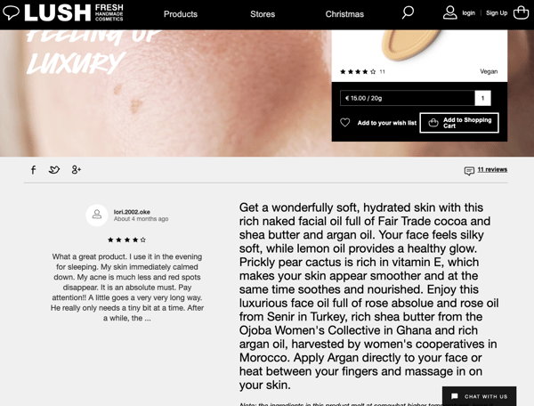
Another psychological principle is the Endowment Effect. This is when a product feels like it belongs to the customer already, endowing shoppers with a sense of possession.
Lush leverages this effect by showing how the product is used, including the second person address “your face”.
When something is in our possession, we transfer a sense of ownership onto that product, which increases the chances of buying it.
All of these psychological principles can be implemented as behavioral nudges on your PDP if done correctly. Scarcity, Anchoring, the Endowment Effect, even Autonomy, Authority, Social Proof… there are so many opportunities - however, they should be grounded in psychological theory to ensure the most customer-centric approach.
But we’re getting ahead of ourselves. If you want more details about how to apply and test these using AI (I know, right, how exciting!), feel free to get in touch.
Otherwise, let’s continue.
You should always be updating your pages so that they’re in line with your brand direction. Similarly, continuously test load times so that your pages are optimized.
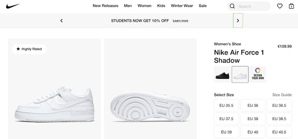
Nike, for example, includes a dynamic banner over all their product pages that shows a discount for students.
This is especially effective for the Back to School season, so they draw attention to the campaign, whilst providing relevant products.
The page also looks freshly updated.
Jennyfer: Blurry product photos too zoomed in to show the image, resulting in slow website load time.
We want to help you avoid these faux pas at all costs. By now you probably have an idea of how we are big fans of eCommerce psychology. We also have years of experience optimizing PDPs for different retailers.
For your eyes only, therefore, our in-house psychologist has taken his expert lens to one PDP that needs improving, and one with some best practices integrated within.
Here’s what he discovered.
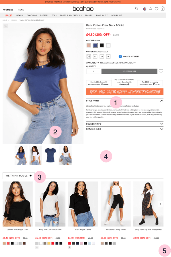
Boohoo PDP Score: +3, -6
1) Feature product images & visual commerce
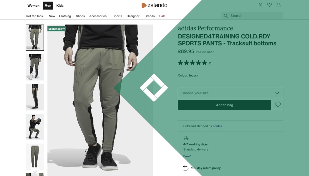
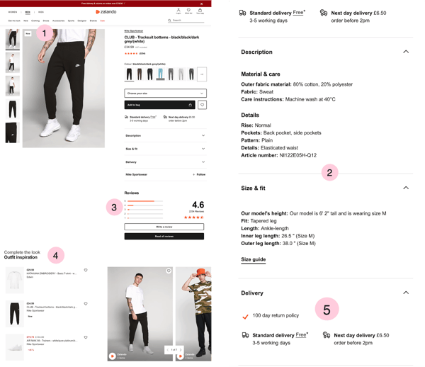
Zalando PDP Score: +8,-1
This is just a sneak preview to a full webshop expert review, if you want our team to carry out one on your webshop, contact us.
We’ve also put together a trend report of the best webshops out there.
This article has taken you through nine best practices for your PDP design and showed you how to analyze a PDP with two examples.
To recap, these best practices are: featuring product images and visual commerce, showing the size and heigh of your models, including clear, detailed and truthful product information, providing technical information, offering product options when relevant, showing your customer reviews, featuring strong CTAs, leveraging psychology in your messages, and continuously optimize your product page.
Armed with these tools, you can carve out your competitive advantage when it comes to digital merchandising.
Good luck!