Get the most out of your Product Listing Page with these psychological best practices
Get the most out of your Product Listing Page with these psychological best practices
You’re optimizing your search, navigation, filtering, and taxonomies on-site. All with the goal of driving your shoppers through the conversion funnel to your eCommerce product pages.
CRO is great. You’re doing a great job.
By why settle for great when you can go for brilliant?
The truth is, you’re just scratching the surface of what you can do when it comes to designing and optimizing your product listing pages (PLPs) to facilitate product discovery. The real gold of PLP personalization lies at the intersection of psychology and design.
Now you might be thinking, how does psychology come into play? If you’re familiar with UX design, psychological marketing is your baby. But merchandisers don’t always get opportunities to apply science in an actionable way.
A Baymard Institute study found that the design and features of a PLP impacted user’s success rates at finding products they wanted to purchase by 400%!
Psychology will help you optimize your PLPs in line with the decision-making and behavior of your individual shoppers.
This article will show you great PLP design through the lens of psychology. I’ll show you examples, key PLP best practices, and two teardowns of webshop PLPs by our in-house consumer psychologist.
I’m already buzzing at the thought.
This is your Product Listing Page Handbook. Use it to:
Let’s start at the top.
A product listing page presents a list of products based on a category of search query. On the PLP, your customers are goal-driven. When they get to the product detail page (PDP) this is where they become information-driven. Therefore, it’s important you help your shoppers achieve their goals on the PLP.
A brick-and-mortar equivalent to a great PLP is one that’s easy to navigate, well categorized, and puts important products at the forefront without creating an overload of messages.
It’s NOT this: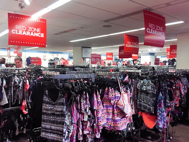
Business insider “messiest stores we visited this year”
Which is why design is so important. It takes a user half a second to decide to leave a website, and visual perception is the first step in that decision.
Designing your PLP in line with your shopper’s goals will guide them to the PDP and through to checkout. Which means you need to understand what those goals are to begin with. Hence the importance of CRO psychology.
Understanding what drives your shoppers on an intrinsic level will help you establish their shopping states, looking at their jobs-to-be-done (JTBD) at specific touchpoints throughout their journey with your brand.
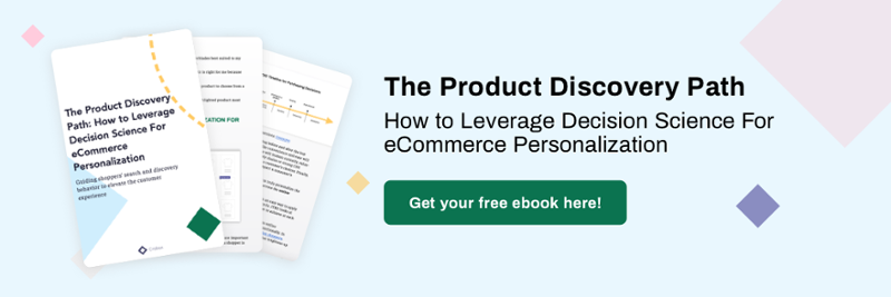
We love this topic so much we wrote an ebook about it! Read it here to learn how to leverage psychology in the realm of decision-science to understand and guide behavior at different points of the JTBD framework.
Finally, each product you show on the PLP links back to one of your category pages. Meaning, the PLP is also the centralized page where you should let your eCommerce SEO and internal link building shine, building some backend authority.
Ultimately, a strong PLP will allow your customers to foster brand intimacy. On a user level, it:
All of the above are important steps in your personalization journey. It’s about a) facilitating decisions, b) guiding behavior, and c) personalizing based on these psychological processes.
Let’s take a look at this in practice.
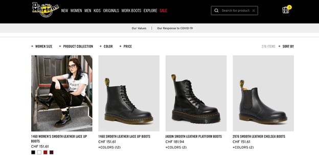
Why we love it
Why we love it as consumer psychologists
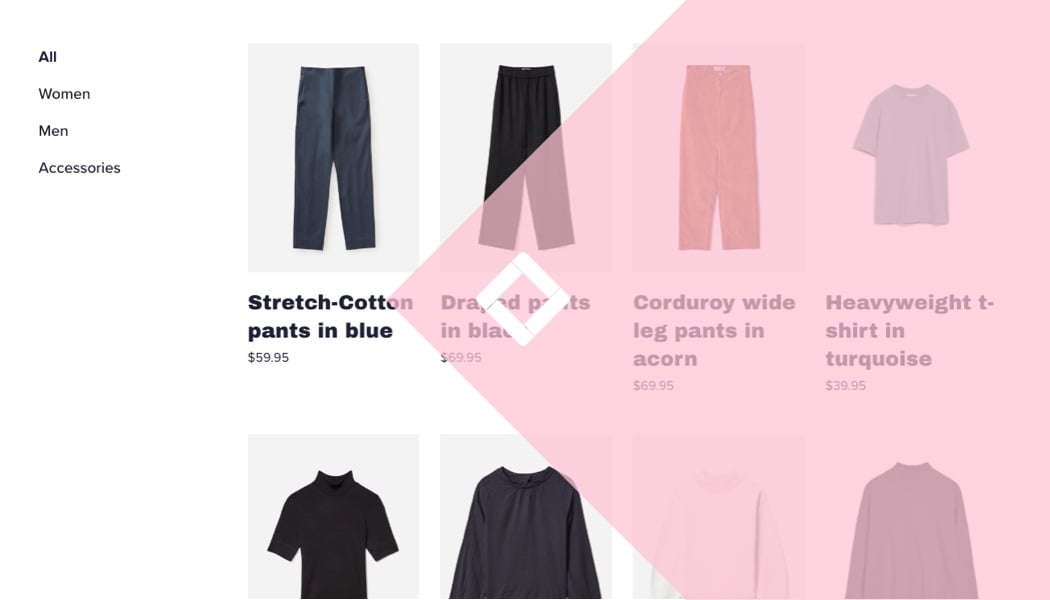
Having color options beneath a product image straight from the PLP increases autonomy for the user. Psychologically, increasing autonomy is a great nudge. Nudges are small changes to the PLP that encourage decision-making (read all about nudge marketing and what nudges you can apply yourself!).
Autonomy on the PLP provides the shopper freedom of choice without inflicting choice overload, to drive click-behavior from the PLP to PDP. We’ll deep-dive this principle later on.
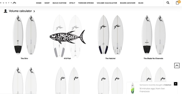
Why we love it
Why we love it as consumer psychologists
In line with nudge theory, Rusty Surfboards’ smart notification also presents more information to the shopper whilst leveraging Social Proof in its copy.
This draws attention to the board “The Hatchet”, making it more appealing to individuals who look to the behavior of their peers when they’re unsure of what to choose.
Smart notification nudges:
Why we love it
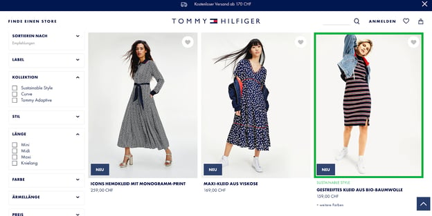
Why we love it as consumer psychologists
Personalized wishlists, favorites, or curated wardrobes increase autonomy and are non-intrusive as far as PLP add-ons go. Plus, highlighting a sustainable attribute on-site can generate important psychographic data.
Psychographics are the values, beliefs, opinions, and desires of your customers. If sustainability as a value appeals to certain customers over others, you can begin to create value-based communication.
For example, if a customer segment responds to the “sustainable style” of the product (in terms of increased click-behavior), then Tommy Hilfiger can leverage this messaging in their other communication channels.
Eventually, data of this kind will pave the way for psychographic segmentation, where you can begin to cluster your shoppers based on their likes, dislikes, and ultimately who they are as individuals rather than just consumers.
Why we love it
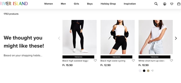
Why we love it as consumer psychologists
The “trending” product badge is a good nudge that leverages Social Proof. Recommendations can also be framed from people in positions of power or experts.
For example, these can be recommendations from the brand itself, designers, or influencers. Test these different recommender styles on-site to see what your audience responds to.
“Recommendations are strong because they leverage different behavioral principles. In a bookstore, for example, I’ve seen recommendations from the store itself (Authority) and recommendations in the form of notes by other people (Social Proof). You can bring this in the online world too, but it’s always about testing messages on your platform.” - Patrick Oberstadt, Consumer Psychologist at Crobox
Now that we’ve had a look at our favorite designs, you can probably tell how there are a few common things that stand out. Continuing with the rule of four to keep things simple, here are four best PLP practices that will always work.
However, because they are psychologically driven, you need to be able to execute them in the most efficient way possible. So read carefully and apply accordingly.
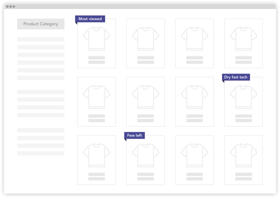
Product badges on the PLP are the use of labels on a product image to highlight something that is special about the product. The label will either show information like a product’s attributes and benefits or have a behavioral nudge to trigger shopper purchase-behavior.
For example,
Both product attributes and behavioral nudges work really well to drive behavior. At Crobox, we leverage both types of messaging. Our AI learns from shopper behavior in order to show the right message at the right time to the right person. If you have the digital maturity (and/or budget) to use AI, your messages can be auto-optimized per individual.
We also collect insights on a message and product level, to see what messages drive click behavior on the PLP. But if you‘re not at this level yet, don’t fret. You can just as well A/B test your product badges.
If you do use product badges on the PLP, make sure you don’t overload the page with badges, have some consistency, and ensure shoppers are delivered the same badge on the PDP.
Allowing your shopper’s the semblance of autonomy on your webshop is important to remain flexible and streamline their decision-making. I say “semblance” not because you want to trick anybody, but because you don’t want to inflict choice overload.
Tricky or manipulative persuasion techniques are called Dark Patterns, which you should avoid at all costs.
On the PLP, you can increase autonomy by:
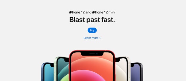
Apple’s PLP is the epitome of fluent, from brand style, rhyming words, and perceptually pleasing to the eye
The easier it is to understand what is expected to reach a goal and make progress to that goal, the better the experience and likelihood of conversion success.
Cognitive Fluency means aligning your PLP design in terms of:
So use big and clear images (which will encourage 94% more views) and don’t surprise your users, unless that’s part of your brand style, like some luxury brands.
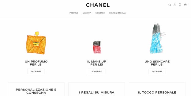
Chanel's 2020 Mother's Day campaign, where they got kids to draw the perfume bottles to show on the PLP. For more on appealing to the psychology of luxury consumers, read our Luxury Report.
Have clear navigation between pages, transparent and truthful messaging, and stylize the page in line with your brand guidelines to create a fluent PLP experience.
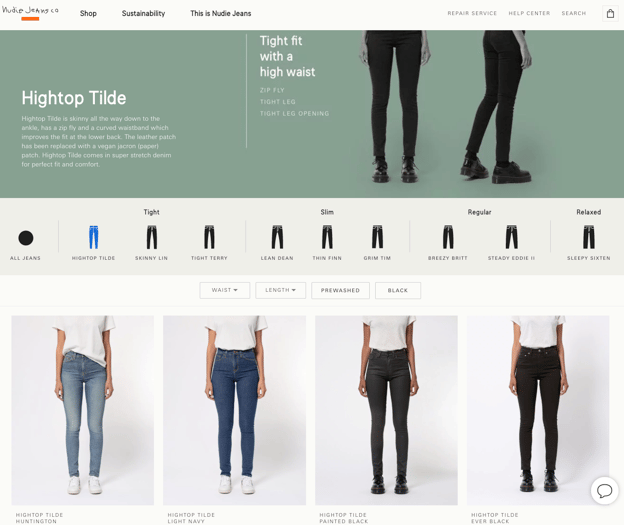
Nudie Jeans clear category options on PLP
To encapsulate everything above, the foundation of your PLP design should facilitate your shopper’s goals. Of course, this will vary depending on what those goals are. Nevertheless, here are some things you can try:
To understand more about what guides your online customers, you can track behavioral data, collect psychographics, and leverage tools to learn what your customers love about your products.
You now have four examples to learn from, and four tried and tested psychological approaches to making the best and most personalized PLPs.
But there’s more.
Our in-house consumer psychologist has years of experience carrying out Expert Reviews on different webshops. For these examples, he takes his expertise to review Intersport and Zalando’s PLPs.
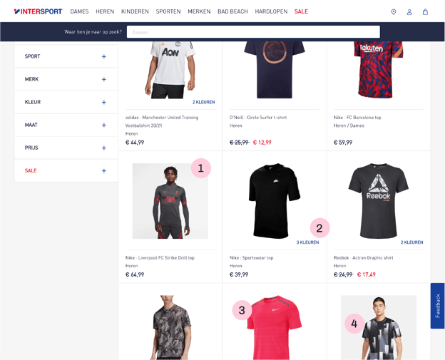
Intersport uses different styles of images throughout the lister page which makes it an inconsistent experience.
They use very small images which makes it hard for someone to assess the item like this. If you don’t have an overall impression of what you’re looking at, this causes cognitive friction, psychologically setting the tone for the rest of the customer experience.
Intersport shows us that the product has multiple colors. However, you’re unable to interact with the text that says it. Meaning, if the shopper wants to find out more colors they have to go to the PDP, creating extra work for the customer.
A better strategy here is to show the colors as small icons so the shopper can already see what is offered. If they have to click on the product just to see the colors this makes the message counter-active. Generally, messages or badges on your PLP should be either transparent (full disclosure) or intuitive.
You can’t interact with the images besides going to the detail page. Therefore, you can’t see alternative angles or other colors. Also showing the other colors on the item without having to go to a new page is important. Otherwise, if someone wants to quickly explore colors they’ll have to click the item first instead of hovering, for example.
It’s also missing any highlighting of specific items to help the consumers with their decision-making. There is no way to find out what product is popular, how others have rated a product, or what some key benefits or attributes of the products are.
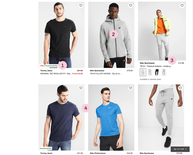
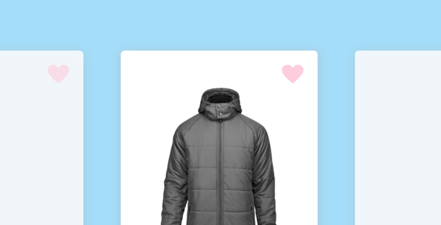
Zalando uses labels that highlight specific attributes and benefits of certain products. This both reduces choice overload for consumers and informs them. But they could introduce more variations to give more information rather than just on sale or sustainability.
Zalando uses big images that make it easier to have a look without clicking on anything. The images also make certain details more visible. This makes the product more attractive.
Hovering over a product image will give you a different view of the product and will also show you the different colors that are available, no click needed. Also, Zalando gives you the opportunity to save the item to your wishlist. Giving people the opportunity to return to their wishlist at another point in time is valuable as well because it makes it a lot easier than having to go through the website again to find all your favorite items.
Consistency in imagery and photography makes it easier and more pleasant to go through this lister page. The grey background is consistent and clean, promoting fluency.
You now have the tools to make the most brilliant PLP out there. Not just for your CRO, but for your customer-centricity and to take your personalization to the next level.
In the future of eCommerce, psychology will be so interwoven in your product page design you won’t have to blink twice at terms like choice overload, fluency, or decision-science.
Get ahead of the curve and start applying these practices now to stay on top!