How to optimize the guided selling experience in both a human and AI-driven way. Learn to leverage conversational search.

How to optimize the guided selling experience in both a human and AI-driven way. Learn to leverage conversational search.
Consumers are becoming more at ease with technology, changing the way many interact with it. And one major change eCommerce pros have noticed?
Their shoppers are now using more natural language as they search and discover their products.
Instead of conducting a search for "hair color" a consumer is more likely to search for "What hair color should I use?"
Think about it. How many times have you searched, "hair color", instead of "what hair color should I use?".
Provided your intent is to color your hair.
According to Google, over the past few years, searches that include "I" in the sentence have increased by 65%. Shoppers alike are now searching, can I, should I, how do I, do I need, etc.
This is coupled with how easy it is for consumers to use and interact with technology.
But with the rise of savvy consumers and technology, comes the rise of content fatigue. Or, in other words, choice overload.
The major change for retailers in the past few years is the use of natural language technologies to guide product sales.
For you digital marketers out there, this means adapting to survive, and sifting through content for your customers to avoid the fatigue that comes with too many marketing communications, too many product categories, and just too many products.
So how do you fight content fatigue? How do you consolidate your brand's competitive edge?
You leverage conversational search and guided selling to enhance the product discovery experience on-site.

As the name implies, conversational search is the use of complete sentences and other natural sounding verbal units or phrases in search queries.
It's also about how search engines use their artificial intelligence (AI) algorithms to interpret those queries.
This is a new type of philosophy for the way humans and computers interact. The principle is that users can communicate in full sentences to devices and receive human-like responses in full sentences or dynamically changing questions to help the user best.
It's a shortcut to alleviating content fatigue because it provides personalization with a product discovery path that is tailored to the individual.
Pretty cool, right?
But you’ve heard it before: With Alexa’s on the rise, how is this different?

Conversational search is when users can search for queries with natural-sounding phrases and get replies to their queries in a similar tone.
Essentially, you can think of conversational search as if you were talking to a friend and looking for a particular product or service and getting responses in a conversational way.
Voice search, on the other hand, allows users to submit spoken queries but returns answers in formats (whether text, voice, etc.) that don’t resemble an actual conversation.
This type of search system is essential to eCommerce SEO because it takes complex grammatical sentences and uses context from previous interactions to provide more helpful and comprehensive results.
For example, imagine a shopper uses a chatbot on your webshop to find a pair of sunglasses.
In most cases, the AI that utilizes conversational search may better understand the context of the query and recommend a particular product that will help to resolve the problem that they're facing.
This is beneficial for a number of reasons.
When people are able to have conversations about solutions they need and problems they have, they’re more inclined to trust the recommendations as conversations will lead to a better understanding of the obstacles they face and more useful solutions.
This means you can curate content that will promote your products with more specificity. Forget robot-like jargon, this is a more human way to curate product-specific content.
Finding, exploring, and buying products take a lot of time and effort, doesn’t it?
And the thing is, online shoppers require quick and easy shopping times. Streamlining the search and discovery effort for your consumers is paramount here.
Conversational search allows users to sift through various choices more quickly and easily which increases the efficiency of shopping online, reducing content fatigue.
Conversational search quite literally asks the customer questions to get data consent when they shop with you.
In a world where customers are requiring more stringent data protection, collecting zero-party data is the way to go.
Plus, this kind of ‘customer-approved’ data will feed your internal systems with more information.
For example, conversational search means that AI understands what words customers use and also understands the context in which they were used to reflect a similar tone in conversation, which will make shoppers feel like your brand knows them.
But now you’re probably thinking – what does this look like in action?
Check out how these five big brands are providing exceptional conversational search experiences to help customers discover their products online.
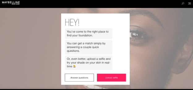
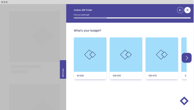
This popular makeup giant came up with a scalable solution to help its customers find the best products for their unique skin coloring.
Their product finder asks a series of simple questions to help emulate the in-store sales expert in order to guide shoppers through the sales funnel based on the different answers they provide.
Through the use of an intuitive chatbot, the company sparks a conversation to engage visitors and springboard product discovery.
The “Bike Bot” is a guided selling tool that helps this bicycle seller to better understand who its customers are and help the company make the right product recommendations so customers don't have to work hard to find the best bike for their needs.
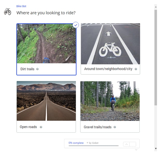
Instead of focusing on different technical attributes of their products (such as you would in old-school-faceted search), they use guided selling to discover the customer's actual needs.
They do this by asking questions from an individual’s perspective such as:
…and so on.
This is an interesting approach as the bike bot helps the company understand the problems and issues of the customer as opposed to recommending a bike based on technical specs.
Data like this can be incredibly powerful for a brand to have because it helps them build a true persona of their customers as well as segment them based on interests.
This becomes intriguing in their sales and retargeting efforts as well. For instance, if you used the “Bike Bot” and choose that you ride 6-7 days per week, marketers then know that you’re an enthusiast and that you’ll require more bike maintenance than the average bike purchaser.
In addition, if they pay attention to their customer pain points for other enthusiast riders, they may be able to upsell you on additional products like padded bike shorts.
If you simply list bikes on a website with specs, you’ll never know how often they ride.
If you don’t know this information, you’d be advertising to all of your customers instead of the right segment of your customers. This will either lead to a reduction in ROI from each sale due to ad spend, or your acquisition cost will be too high to turn a profit.
Canon has a helpful camera selector app that allows users to find the perfect camera to suit their specific needs.
In addition to recommending the best camera for you, their product finder tool also lets you compare features and specs across the company's entire range of DSLR, digital compact, and meritless compact-system cameras.
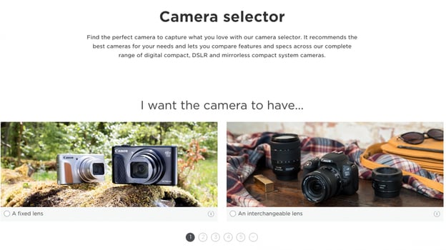
This tool makes it easy for the company to cater to its massive and diverse audience to provide buying advice based on the customer’s preferences and needs by better understanding their psychographic data.
E.g., what their habits are (how often do they use the camera) and what their interests are (what type of photography will they primarily be shooting).
This results in a simpler search experience that is better aligned with each individual's natural decision-making process.
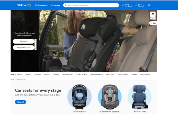
Walmart has an interactive car seat finder to help parents find car seats for every stage so they can achieve the safest fit for their growing kids.
You can choose whether it’s an infant model, convertible, booster, or rear-facing and forward-facing options. In addition, this tool lets you use the simple slider to choose the age from infants to toddlers, all the way up to 10-year-olds.
While Walmart then focuses on the specs of each model and the user has to choose based on those parameters, the tool helps Walmart understand the general needs of customers prior to diving deep into the specs of each model.
It’s the beginning of a search query, which is where conversational search comes into play. This tool makes it easier for parents to find what they need, compare prices and ratings so they can have the confidence that they are making the right purchase to suit their needs.

This popular sunglasses seller uses guided selling techniques with dynamically changing questions for different shoppers based on prior responses to help users choose the best sunglasses for their face shape.
The brand uses sophisticated digital advisors and guided selling solutions that are able to understand context so they only display follow-up questions that are relevant to each current user for a more personalized experience every time.
Furthermore, during the process, the guided selling solution also considers any information available about known preferences in order to re-target users with products in line with their previous answers.
As you can see, some brands have already embraced conversational search as part of their content strategy.
With the huge shift in the way people conduct searches online, marketers and brands must now use more natural language to create intuitive experiences across all of their digital touchpoints.
This is the one-shot way to reduce content fatigue and create delightful product discovery experiences.
Conversational charts can be used to create more effective and higher-converting product finders.
After locking down the main keywords and phrases that are typically associated with your product, you can then brainstorm more conversational phrases that go beyond these keywords that your customers might be using to find the right products.
To learn more about product finders check out this ebook:

One of the main benefits of integrating conversational search tactics within a guided selling strategy is that it assists in decision-making which is fundamental to your success, psychologically speaking.
When shopping online people make choices at every step in the funnel and journey – that is, before they buy, during the purchase, and after the transaction is over.
For the most part, your customers have too many options and are drowning in choice, hence content fatigue.
Guided selling helps you prevent this type of content fatigue by giving you a way to filter through multiple product choices to give your buyers a narrower and more relevant view of your collection.
The conversation you initiate with your customers is at the core of guided selling and helps you to educate your visitors on the product benefits before price.
When you have a better understanding of the customer's context and need, it gives you the perfect opportunity to showcase and explain some of the features of your product and how they can benefit the customer, as well as why YOUR product is the perfect fit for them.
This is all curate content that will alleviate content fatigue in favor of personalization and a strong brand voice.
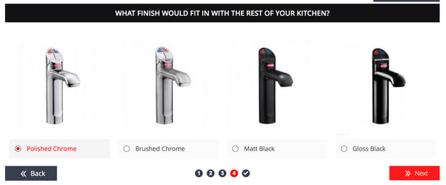
For instance, customers looking for a shredder might benefit from being educated about the different types of shredders on the market, as shown in the example below:

By the time you get to a discussion on pricing, they are already educated on the potential value they stand to gain from purchasing your product, as opposed to regular webshop interactions where customers often begin by filtering products on price.
Another element of educating customers often includes using online courses platforms to explain how a service works or how to use a particular product.
Integrating product discovery tools with online courses, instructional webinars, educational YouTube videos, or even engaging TikToks is a way to effectively make the most out of your digital marketing mix.
Ultimately, using conversational search and guided selling will result in a massive reduction in returns, increased conversions, and a boost in sales for your business.
Conversational search and guided selling can help you better connect and increase engagement with your customers.
With guided selling, you can start a conversation, and rather than guess what the visitor’s needs are, you can simply ask questions such as:
… and so on.
The true benefit of conversational search in your guided selling strategy is that even if you have information on your visitor (for instance, if it's an existing customer who is logged in), you still don't know what drives them during that particular visit.
But, asking questions like the ones outlined above will allow you to start a conversation in much the same way that a traditional sales employee would.
Then, based on this type of input, you can start making appropriate product recommendations for each visitor.
The image below is a great example of how a product seller might guide customers toward the right purchase and get them engaged during the buying process:
Whenever customers engage in the sales process, they are a lot more likely to actually finish the process (that is, buy the product).
This is called the Endowment Effect and it suggests that the more people interact with a product or brand, the more they instill a sense of ownership onto the product or experience, and the higher the likelihood for them to convert.
For more psychological tips to optimize the guided selling experience, download Crobox’s Guided Selling Handbook at the end of this article.
By now, you should understand how conversational search can benefit your business.
In this post, we covered what conversational search is, how it’s different from voice search, and included numerous examples so you can see conversational search in action.
But as time goes on and marketing becomes more sophisticated (plus, content fatigue more and more prevalent), it’s reasonable to assume that conversation search will become a staple for most brands.
Still, it's up to you now to start testing these different conversational search approaches, and overall optimizing your guided selling on-site to reduce content fatigue and choice overload.

Has this article answered your questions on how to use conversational search for optimized guided selling? Share your thoughts in the comment section below!
 This post was written by Ron Stefanski, who is a website entrepreneur and marketing professor with a passion for helping people create and market their own online business. You can learn more from him by visiting OneHourProfessor.com. Or, connect with him on YouTube or Linkedin.

