Easy on the eyes, easy to navigate, and easy to find products: these are key to webshop fluency.
Technology moves fast. And design doesn’t do a half bad job at matching the pace. When you consider where we came from in the early days of the web, the current online landscape may feel like a breath of fresh air.
When it comes to conversion-driving online experiences, gone are the days of flashy popups and cluttered landing pages.
In place of these cheap shots at persuasion, we’ve entered an age of minimalism and white space.
With every design choice, we’ve started to ask ourselves: does this image/graphic/text truly add value, and can it be said with less? This transition to simple and intuitive website design is a logical transition.
UXers and conversion junkies alike will agree that the online experience needs to be smooth. Because, if this is not the case, the attention or ability of the users will be lost in no time.
In previous blog posts, we’ve talked a lot about how you can use psychology to make your website more persuasive, break down shopper barriers, and motivate shoppers to behave in a desired way.
And while all of these things are critical parts to a creating and maintaining a positive online shopper experience and CRO, there is one overarching theme that should be kept in mind with all design and strategic decisions: user fluency.
Users’ fluency determines their perception
Fluency in psychological literature is a mental process with many faces. But, ultimately, it can be understood as the ease (or difficulty) someone has when processing information.
For example, if something is hard to read, individuals will perceive the task in front of them as harder to complete.
One study tested this effect by providing two groups with a text explaining an exercise routine. One of the versions was provided in a difficult-to-read brush script, and the other was given in an easy-to-read Arial font.
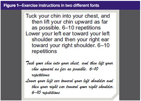
The authors found that those in the condition with the more difficult to read font perceived the exercise as being more difficult and time-consuming.
The reason that this happens is that when we humans make judgments, we use various external and internal cues. Processing fluency is one of the most prominent internal cues we use in reasoning.
We are subconsciously (and, often, consciously) aware of how difficult it is to process information. And this internal judgment of difficulty can aid us in understanding and making inferences about the external world.
Our mind is always looking to conserve energy. Fluency is a reaction to that desire. For instance, a quick exercise. Answer the following questions to yourself (and don’t peak ahead!).
What do you call a tree that grows from an acorn?
An oak.
What do you call a funny story?
A joke.
What do you call the sound a frog makes?
A croak.
What is another word for a cape?
A cloak.
What do you call the white part of an egg?
If the word yolk came to mind, you’re not alone. I fell for it, and so did my poor colleagues that I try these “fun” psychological experiments with. In fact, it’s so widespread that academics refer to it was the Yolk Phenomenon… And no, I’m not kidding.
What’s happening here is that our brain is using heuristics, in this case, the rhyming nature of all the previous words, to come up with the correct answer. Our mind enters a fluent, auto-pilot mode in an attempt to save its precious mental juice.
Fluency has a big impact on the way we perceive things. We can perceive fluent statements to be more true, likeable, frequent, famous, and to come from more intelligent sources.
Online user fluency’s impact on experience
To no surprise, fluency plays a big part when it comes to user experience and online conversion, as many similar psychological marketing strategies enable. The easier it is to understand what is expected to reach a goal and make progress to that goal, the better the experience and likelihood of conversion success.
With the growing amount of websites, having a visually pleasing and engaging website has become one of the make it or break it factors in turning shoppers into customers.
In fact, incoming website visitors can assess the visual appeal of a website within half a second of arriving.
That means you need to capture (and win) the attention of your visitors within the first moments of them arriving on your website. If successful, you can turn these passersby into serious browsers. And this visual appeal of a website has a close relationship with (perceptual) fluency.
Perceptual fluency is the type of fluency that directly relates to the aesthetics of a website and how that influences their processing.
Additionally, having a fluent experience while on a website has been linked to positive feelings. Which makes sense, I can attest to the positive affect I feel when I land on a beautiful webpage. Those high contrast, simplistic designs are just what I need to get my OCD happy-tingles to surge throughout my body.
Various studies have been conducted to define the exact features that contribute to a more fluent experience. Let’s take a moment to go through the most important.
Goodness of Form (Font)
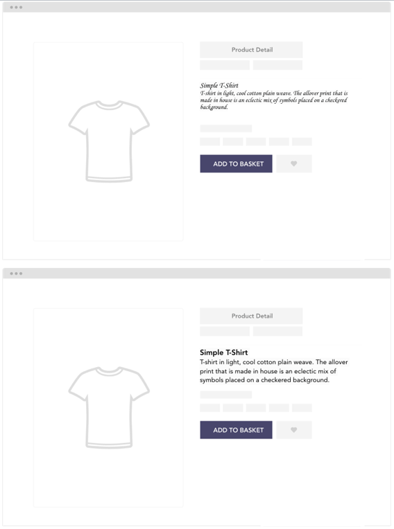
Perhaps this is the typography nerd in me flaring up again, but beautiful, easy to read fonts make a difference. The number of websites I have visited with cringe-worthy fonts is too many to count.
And although we are now moving quickly in the right direction, I still manage to stumble across emails or webshops with Times New Roman, Comic Sans, or - gasp - script style fonts. The days of PowerPoint are long over (I’m sorry university professors).
“Goodness of form in an informational format refers to text readability, with readers being able to process one font type more easily than another.”
- Mosteller, Donthu, & Eroglu, 2012
Sans Serif type fonts are all the rave right now. And for good reason! They are pleasant to look at and, more importantly, easy to read. Like in the example I previously explained, when individuals struggle to read text on your website, they will likely overestimate the amount of effort it takes to make a purchase.
Try to make the information search for your shoppers as straightforward as possible by considering your font type, size, and spacing with due thought.
Symmetry
By now, we’ve probably all heard about the studies that have linked symmetric faces to being perceived as more attractive than asymmetric faces.
Well, this effect can be found in various other objects because humans have the innate preference for symmetry. Suddenly those satisfying Facebook videos make so much sense.
You’re welcome.
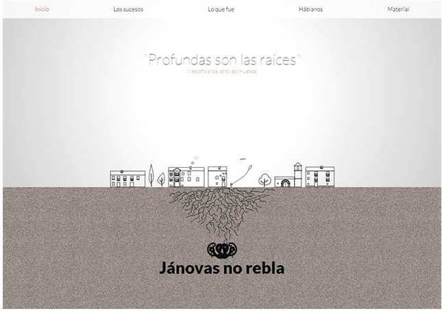
When it comes to web design, you want to try and find symmetry in your landing pages because symmetrical patterns tend to have less information and are, thus, easier to process. In more concrete terms, elements such as including less information and high contrast and clarity are crucial. White space is your friend, use it, abuse it, and enjoy the simplicity of it.
Searching for inspiration, check this out, you won’t regret it.
Figure-Ground Contrast
This fluency-facilitating element is similar to symmetry in the aspect that it flourishes in spaces of white. This element of design presses on the importance of increasing the contrast between the background and the focal point that you want individuals to direct their attention toward.
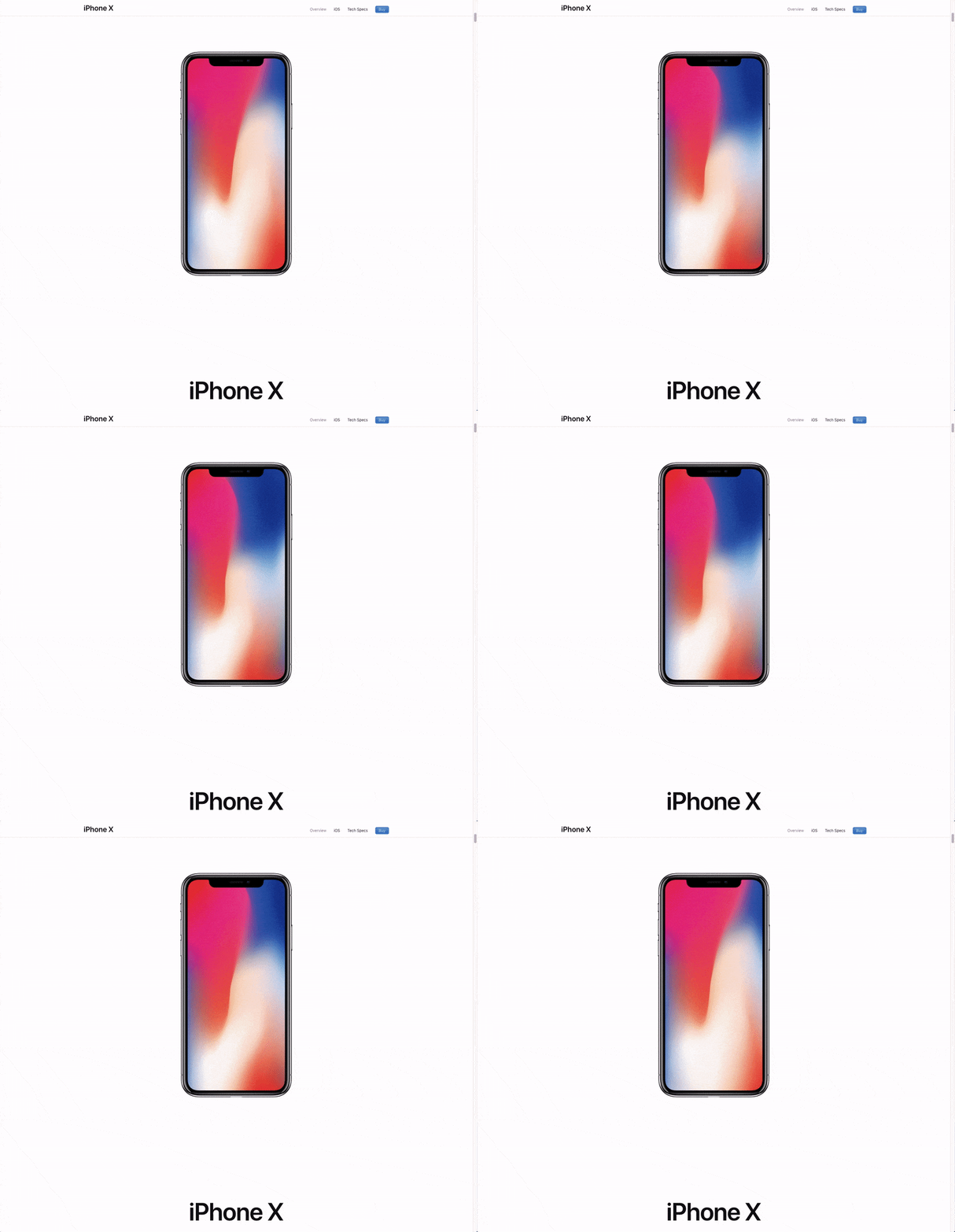
Can an article centered around design really get away with not sharing an Apple example? I think not! Apple might as well be crowned as the beautiful (and effective) design king.
The idea behind this principle is to try and create as much contrast between the background and central image or graphic as possible. Figure-ground contrast increases the speed in which individuals recognize the focal point, which improves their fluency.
Information Density
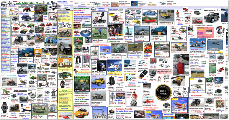
Yes, this is a real website. And the perfect example of everything you shouldn’t do. In the 30 seconds it took me to get a screenshot of this, I could already feel my anxiety rising. Just. No.
Less is more. There’s a reason that this is such a common phrase (and funnily enough, a furniture store in Cape Town (?!)). Think about it; most people don’t want to listen to the long-winded, extended explanation to an answer that could be answered in a sentence or two.
Our human attention span is not so long, so try to choose your words with care and only include the details your target audience are expecting.
When less information is given, it's easier to process, saving that precious time and cognitive resources for tasks that are naturally more demanding (like checking out).
And the better and frictionless these customer experiences, the more customer-centric you can become as a business.
Conscious design leads to pleasurable experiences
Next to their widespread practical applications, these elements have been studied extensively in empirical settings. These studies virtually all come to the same conclusion:
Shoppers thoughts and feelings are positively influenced when they perceive the online presentation as pleasing and easy to absorb. This makes achieving their online goal more enjoyable and less effortful, which leads to a positive evaluation of the shopping experience.
So there you have it, the full explanation of fluency and its relationship to eCommerce webshop design.
Coming out of this article, it’s most important for you to remember:
- Today’s consumers demand better user experiences.
- Obtaining (and maintaining) fluency is a goal in all disciplines. Webshops are no exception, ensure you facilitate this.
- When evaluating your webshop, consider its goodness of form, symmetry, figure-ground contrast, and information density.
- Once you find that happy balance with all these elements, test your designs to ensure it resonates with your audience.
