In this Playbook, we see how to build and design the best Product Finders for the activewear industry.
In this Playbook, we see how to build and design the best Product Finders for the activewear industry.
Between 2021 and 2027, the CAGR of the activewear market is expected at 3.7%. Around the world, exercise is up by 88%.
People are taking more active holidays and working out anywhere and at any time.
In response, Activewear brands are ramping up their digital and omnichannel offerings.
Since more people are shopping online than ever before (80% of the population in the US, and 70 million more people in Asia since the pandemic), activewear products online are in high demand.
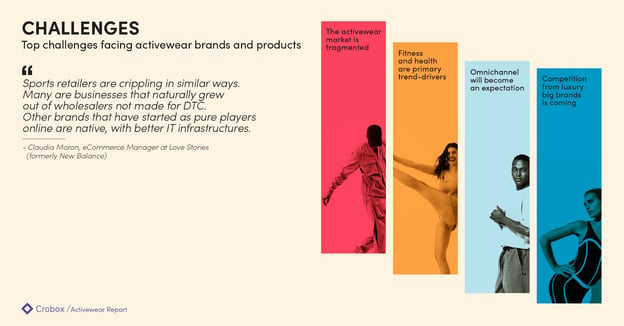
Go to the Activewear Report for a full industry breakdown and market analysis.
Where brands can offer in-store sales assistants to show shoppers the right products for them, online product discovery looks very different.
The challenge for many activewear brands is how to bring in-store guidance and advice into the online environment.
Enter: Product Finders.
These quiz wizards ask questions to the customer to determine their shopping goals. Based on how the customer answers, the webshop can recommend the perfect product.
This brings in-store assistance online, while feeding data back to the retailer that is given freely and within consent by the customer. Hence, staying within data privacy regulations while still personalizing the customer experience (zero-party data).
In this playbook, we take you through Crobox’s Product Finders in three steps:
Top4Sport Shoe Finder: Crobox built Top4Sport’s Shoe Finder to help match shoppers to the right running shoe for them. Our results saw:
Read the full case study here.
“Our clients always want different questions and rules when building their Product Finder. It’s up to us to provide the knowledge and guidance on what makes sense from a behavioral and UX perspective. Together with our clients, we’re able to customize a finder that will lead to the highest conversions.” - Elaine Simpson, Sr. Project Manager at Crobox
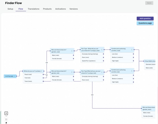
The Finder Flow in the Crobox App lets you visualize how all your questions are connected so you can track the right path for your users.
When choosing your questions, here are a couple of ways to do it:
Whatever questions you choose, you can start with a conversational flow chart to plot the different paths people can take.
Best practices:
“We still haven’t found the right balance of questions – especially because there is no industry standard and our clients have different business goals and customers. The main thing you have to remember is to think like your users, and make sure you’re helping them reach their goals in the best way possible.” - Patrick Oberstadt, Behavioral Designer at Crobox
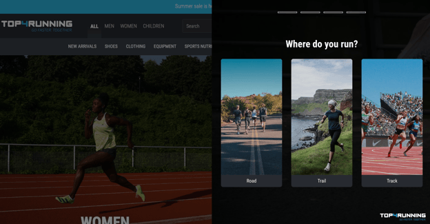
Visuals are a great addition to your product finder. Not only can they decrease text-heavy information (thereby promoting cognitive fluency), but they can show your customers your products, collection, or brand style.
Choosing your visuals goes hand-in-hand with choosing your questions. For example,
Best practices:
For Top4Sport, we implemented the Product Finder across multiple pages to ensure maximum visibility. E.g., Category page navigation (above), slide out on the PDP (below). 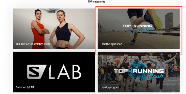
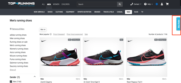
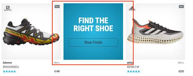
Top4Sport also integrated our Finder on the PDP with Exponea.
Where you place a product finder on your website will depend on what you’re trying to achieve. For example, if you’re pushing a running shoe finder, you may want to show this on multiple pages – but it’s especially important to showcase it on your running shoe category page.
Alternatively, if you’re pushing a deal finder, then this could go straight on your homepage and in the category of products you want to quickly get rid of.
The purchasing behavior behind sneakers is very different from traditional activewear products. It's important that customers have the option to do a Product Finder (or a personality quiz) in order to match them with the right sneakers for them.
Best practices:
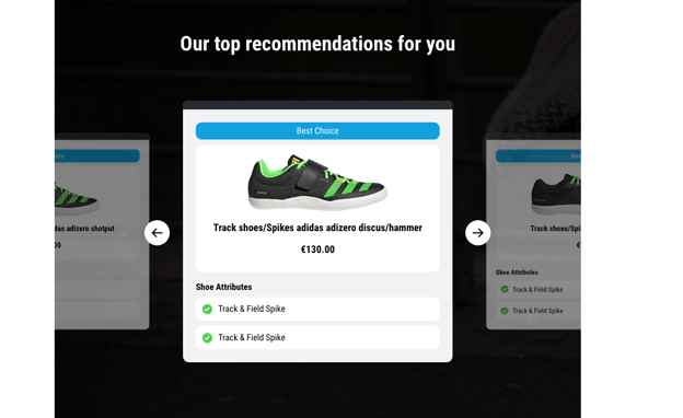
Top4Sport’s final product recommendations show a carousel of ‘Best Choice’ products. Their profiles display their most important attributes to put the right information in front of the user. Clicking on the shoe’s profile brings the user to the shoe’s detail page.
Top4Sport
What products you recommend will depend on how and what the shopper answers as they navigate your product finder. However, there are still some best practices you need to consider as you design your product recommendations.
Best practices:
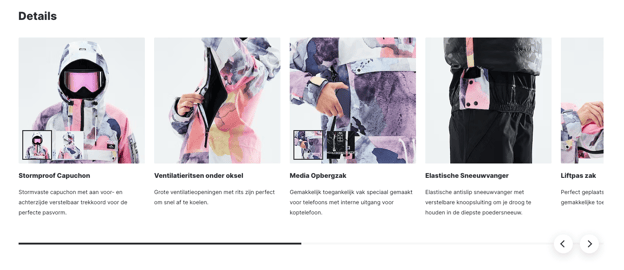
Dopesnow communicates their ‘features’ as ‘details’ to stylize the attributes of their ski jackets.
“Often our clients don’t give us products they want to recommend. That’s fine – we can easily go and find this in their feed. For example, if we’re building a headphone product finder. Every headphone has specific attributes, which we can find in their product feed to see what headphones match what’s been selected.” - Patrick Oberstadt, Behavioral Designer at Crobox
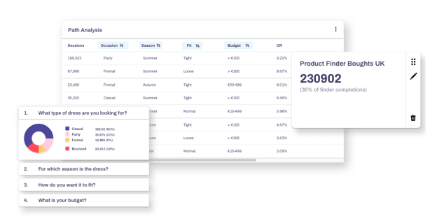
It’s not enough to place a Product Finder on your website and let your customers do all the work. In fact, the more your shoppers interact with your webshop, the more click-stream and behavioral data you can gather.
Crobox lets you collect and track data in a quick and reliable fashion, so you can anticipate the customer and market better.
Best practices:
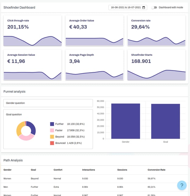
Crobox offers Product Finder results and analytics to visualize your data in one centralized place.
Crobox’s dashboard is both customizable and shareable, so you can control what data you want to visualize to be able to leverage it across departments. Plus, with the help of our in-house behavioral designers, you can take your product finder one step further with psychological insights.
That being said, let’s take a look at some psychological marketing to really build out your product finders in the most behavior-driving way.
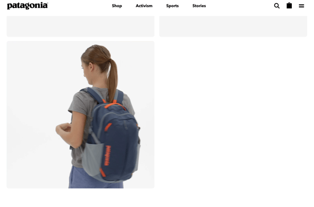
Patagonia’s product videos show the product in use.
Put yourself in your customer’s shoes. If you were looking for a product, how would you go about it?
Be the brand that your customers come to for advice, much like they’d ask a friend. Provide:
Your customers have varying shopping mindsets depending on their situation, context, and time of purchase. These mindsets are called shopping states (or, needs) and can be used to characterize your shopper’s individual experiences.
For example, a hedonic shopping state is directed towards satisfying a positive emotional need, like pleasure, joy, or fun (e.g., shopping for sneakers).

Columbia Sportswear optimizes their taxonomy for US shoppers with a Labor Day category.
Utilitarian shopping, on the other hand, is directed at satisfying a functional or economic need (e.g., a fishing rod for fishing).
Learning to uncover what shopping states your product finder caters to will help you optimize the guided selling experience. These are the different factors that influence each shopping state:
Understanding these shopping states will help you design your product finders in the best way. Plus, it’s a good step towards customer segmentation – you can even test how different shopping states navigate your finder!
Anchoring is a cognitive bias where we rely on the first piece of information given about a topic, influencing the second piece of information we see.
For example, in a 1997 study by Strack and Mussweiler, they asked participants if the Brandenburg gate was taller or shorter than 150m (150m is the anchor).
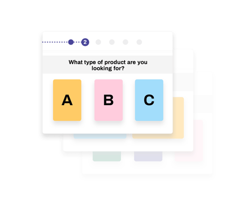
More people guessed closer to 150m if first given the anchor. Without it, people’s guesses varied. The Brandenburg Gate is about 26m tall. In other words, anchoring is a point of reference.
To leverage this in your product finders, you can:
This anchors the middle option as the most desirable (which could be one of your higher-margin products).
There’s a lot you can do just by positioning your answers in a particular way. Consult your behavioral designers for more tips on how to position in the most UX-friendly way.
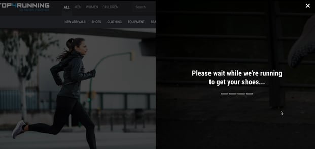
It doesn’t really take time for servers to find the perfect product after someone completes your product finder.
But in-stores, a sales clerk will always go check in the back for you, or spend time looking for the perfect match. You can emulate this in your product finder with a loading screen.
This brings the human back online.
Plus, it creates an imagined sense of effort. Which, if you can show this as a brand, your customers will be willing to reciprocate. It brings another dimension to the online experience – one that is human and conversational but still guided.
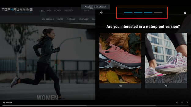
Remember the Goal Gradient Effect?
If your customer can see how far they have left to complete their goal, they will be more inclined to continue.
We don’t see this in many product finders, but it’s a quick psychological win that will drive behavior and completion rates.
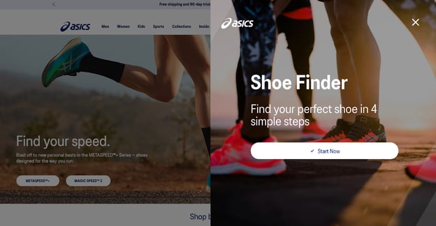
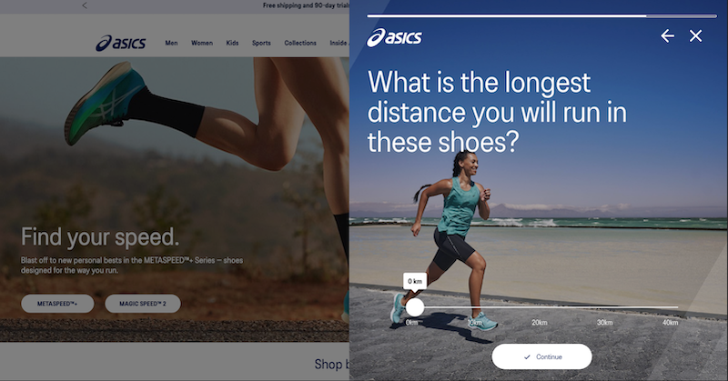
To help bring their in-store sales assistant online, we built ASICS’ Running Shoe Finder. The Finder determines the running goals of the customer to recommend them the perfect product.
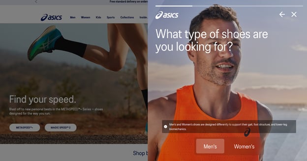
This Finder has been optimzied by leveraging usability testing from the company, Braingineers. By carrying out neuro-usability experiments to test emotions, ASICS was able to see where people experience friction throughout the Finder flow.
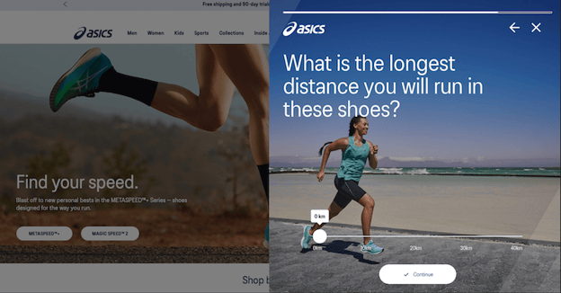
By answering questions on distance, pronation, and terrain, ASICS can also see how people are using their running shoe products.
This data will facilitate their promotional strategies, but also turn product attributes into benefits for the shopper.
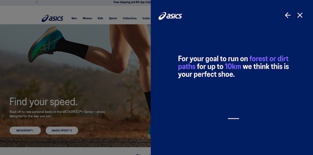
The final recommendation is thus hyper-optimized to the individual.
Since ASICS has one of the most technical running shoes on the market, a Product Finder lets them educate their audience about the superiority of their shoe.
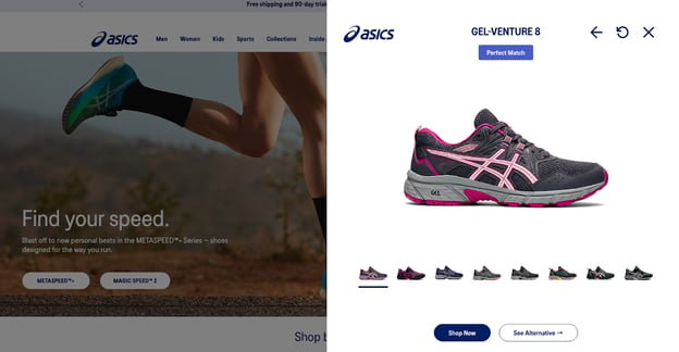
For shoppers, they receive a recommendation that is in line with their needs and goals, in order to avoid running injuries, run in the way they want, and view alternative choices to facilitate their decision-making.
ASICS Running Shoe Finder is, for both customer and retailer, a win-win.
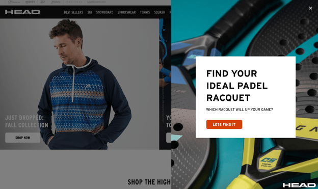
HEAD’s Padel Finder matches customers to a padel. Since padel racquets are quite a specific product for consumers with a specific goal, we tailored the questions as such.
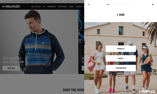
Because, despite this product having a specific function, many padel players will struggle to find the right racquet for them.
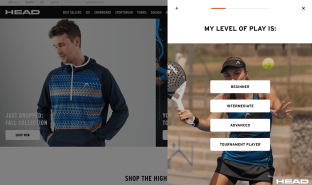
The questions also collect valuable information about HEAD shoppers. By answering what level of play, HEAD can start to segment their Padel playing audience based on if they are beginners, intermediate, advanced, etc.
For beginners, for example, they can send relevant content that gives them tips to getting started. Intermediate players can get education about the upkeep of the racquet. And tournament players could have competition insights in their locations.
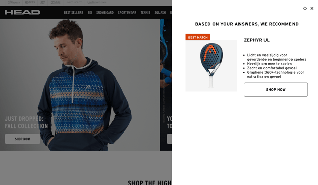
There are lots of opportunities to reuse data from the padel finder, especially when it comes to educating the customer further.
With such a niche sport and small product assortment, educational follow-ups are a great way to keep the customer engaged.
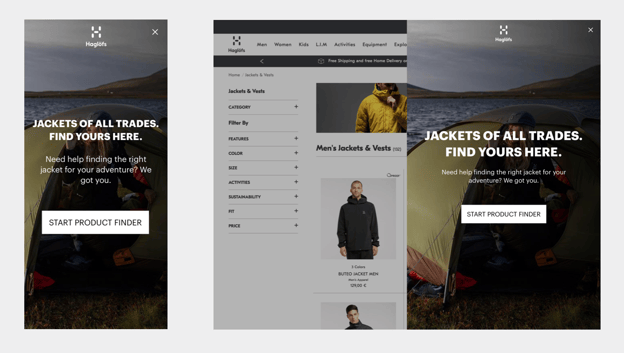
For the outdoor brand Haglofs, we built a mockup of a Jacket Finder.
The goal was to help uncomplicate a product that is very technical – while finding different kinds of product uses.
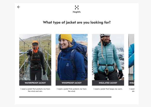
We observed that many outdoor retailers will share product attributes like ‘GORE-TEX’ fabric, or ‘Chin Guard’. But it’s up to the retailer to translate these attributes into benefits for the customer.
For example:
Product Finders for activewear need to leverage human language. They need to show options that are based on benefits and not complicated attributes.
Then, the brand can see what kinds of messages drive behavior, what kinds of products people choose, and, importantly, why.
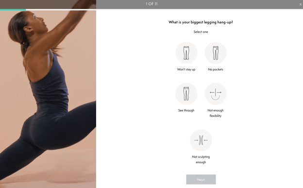
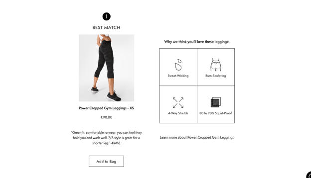
We didn’t build this Product Finder – but Sweaty Betty’s Leggings Quiz is a great example of everything we’ve already discussed.
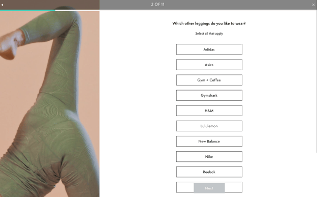
They ask the right questions to determine the user’s shopping goals, while collecting valuable information to:
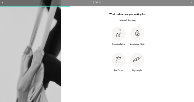
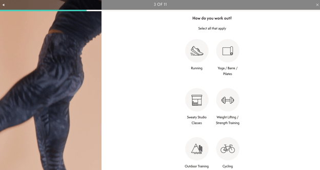
They don’t confuse the shopper with overexplained or complex product attributes. Instead, they choose four attributes that are matched with what their audience needs.
Their choice of ‘sustainable fabric’ shows they understand who their shoppers are (environmentally conscious) and want to put that kind of information in front of them.
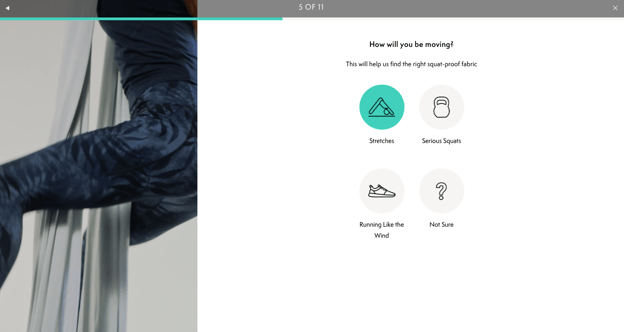
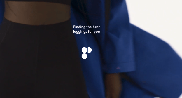
They have a loading screen, and their final recommendation shows the Best Match, Great Match, and Good Match. This is a great example of a leading brand leveraging a Finder in the right way.
In this Product Finder playbook, you’ve seen how to build and step up a Product Finder for activewear in three steps:
To learn more about guided selling in the activewear industry as a whole, download our Activewear Report!