We’ve tried and tested seven psychological pricing techniques to show you how well they work.
We’ve tried and tested seven psychological pricing techniques to show you how well they work.
What is the main point of friction between your customers and your product?
You could provide a personalized and seamless experiences on your webshop, but the thing that will inevitably stop them from converting will be product-price.
As an eCommerce store, it’s thus your prerogative to relieve the so-called “Pain of Paying” and reduce the psychological stress involved with checking out.
Nobody wants to click “pay” hesitantly.
Therefore, the way you frame your prices will have a profound effect on both the conscious and subconscious mind.
Yet, if you type in “persuasion pricing techniques” online, you will be flooded with results.
So why keep reading?
Well, this article will provide seven time-tested techniques, with explanations, examples, and use cases to boost your CRO.
I know, I know: all talk and no show. We’re about to jump straight in.
But wait:
Before moving forward, we would still recommend that you also seek advice from other sources and collect your own unique research.
Before making a drastic change to your pricing techniques online, it’s important to understand the different principles that govern the market.
Still with me?
Good.
Now we can get started.
Here are seven persuasive pricing techniques that you can use to boost your CRO.
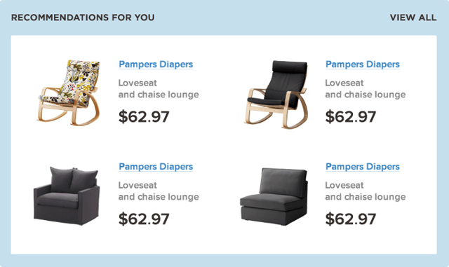
Ah, yes, that predictable .99 price-offering we see so often.
But have you ever wondered about the psychology behind it?
Although it’s most commonly used in brick-and-mortar price tags, eCommerce still has to catch up, and this is costing you sales.
Research conducted by the University of Chicago and MIT showed that sending a large US-mail order with the price ending in “9” (as opposed to a whole number) actually resulted in 40% higher sales.
So, prices that were $39.00 actually sold more than prices that were only $34.00!
In William Poundstone’s book “Priceless”, he calls this “charm pricing”.
Overall, Poundstone argues that this kind of persuasive pricing increases sales by 24% compared to a normally rounded price.
The rule is so powerful it could be attributed to a number of psychological effects: either a product sold at 19.99 is considered “less than 20” (therefore is “levelled down”), or it highlights the left-most feature of the price,
So for 19.99 we would see 1 rather than 2.
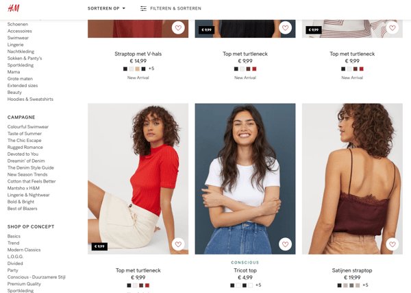
We’ve all been there, probably unwittingly:
Glancing down at the €9.99 bag and thinking “wow that’s cheap!”, only to look at another €10 price to think the opposite (even though that 1 cent logically and consciously doesn’t make any difference).
Get ahead of the curve and use this powerful tactic for your online products by changing the price to .99 instead of whole numbers.
Of course, it’s important to mix these prices up.
If all your prices end with .99 this may cause resistance in your customers.
“Anchoring is a complex cognitive bias, whereby we use existing information as a baseline for our new judgments and decisions” (Hidden Persuasion, Andrews, Van Baaren, Van Leeuwen)
In other words, anchoring is a point of reference:
If you can suggest one price to your customers, they will anchor their knowledge of all the next prices on that which you have already suggested.
The University of Missouri conducted a study on price anchoring, asking a group of undergraduates and real-estate professionals to estimate the value of a sample home.
The subjects were provided with brochures with information about the surrounding homes. Some had standard prices, and some had artificially inflated prices.
Can you guess what happened?
Both groups were swayed by the brochures with the higher prices in them, causing them to estimate the value of the standard priced home as higher than those without the anchor.
The power of price anchoring is so extreme that it even worked on industry professionals!
I was recently browsing Nike.
At first glance, I thought: this stuff is all way too expensive for me!
But I kept browsing.
I then stumbled across €45 leggings - which is still higher than I’d usually pay for leggings, and higher than the industry standard (not to mention my original budget) - yet the other expensive items I had seen made the leggings seem cheap in comparison.
Expedia also used price anchoring before they revamped their website:
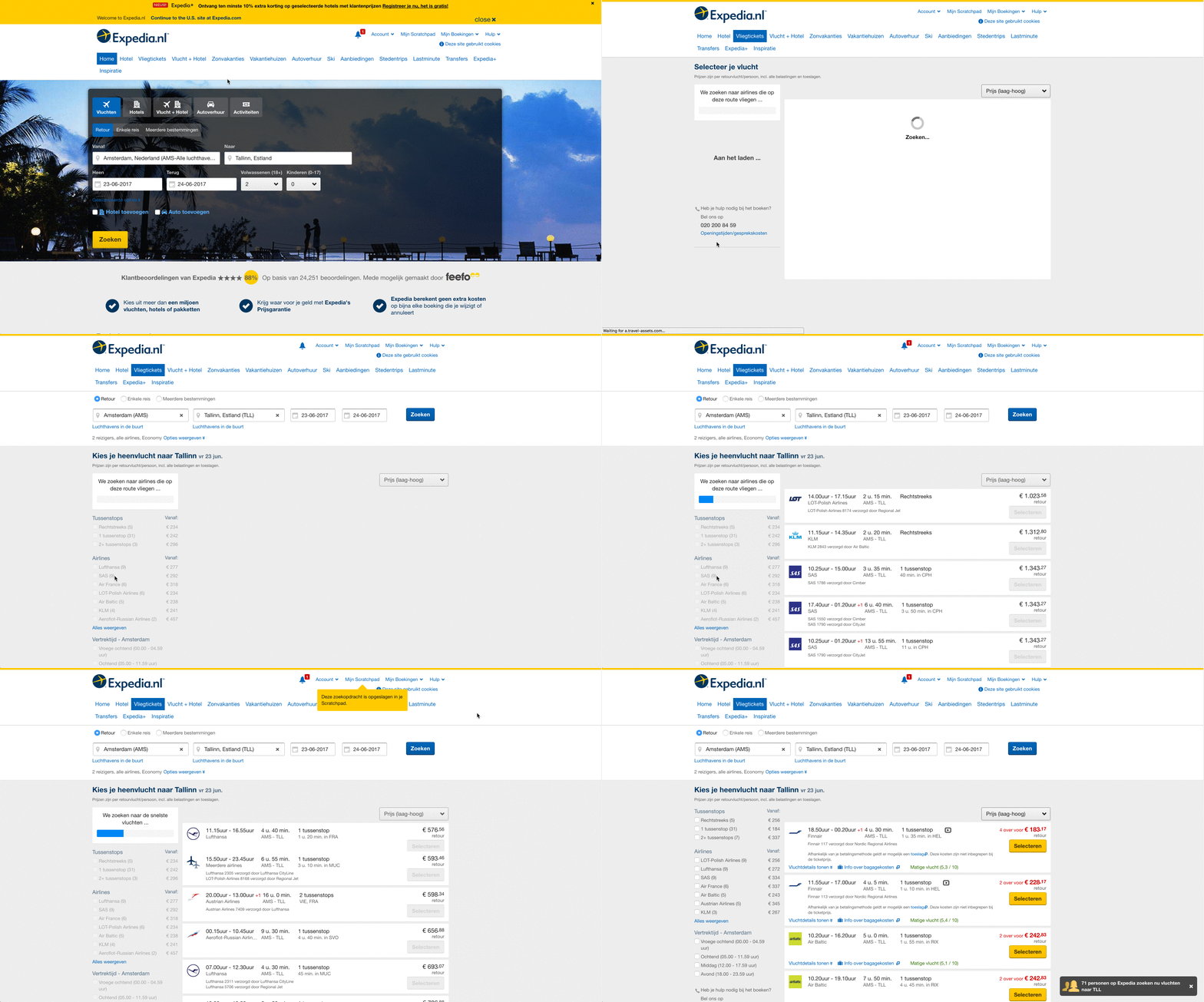
The site loads the most expensive flights first, showing the cheapest ones in red at the end. This alleviates the expense of the “cheapest” price as it has been anchored in what was the most expensive price prior (it helps that the prices are highlighted in red).
And, Apple, of course, who employ price anchoring across almost their entire product range, and are “Anchoring Masters”.
If your homepage is the most common point of entry for your customers, put one of your expensive products on there first to anchor your next products to that tag.
Additionally,
On your product lister page, show your “recommended” products first instead of your cheapest options.
The prices of your products infer a lot about the quality. If you can establish that tone from the very beginning, the individual will hold more accurate expectations of your products.
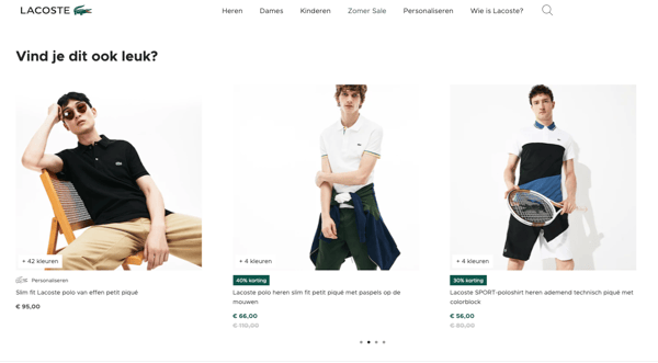
Another way you can leverage this persuasive pricing technique is by exposing people to higher incidental prices.
For example, if you have a t-shirt for €15, show your customers that other shirts in the same range or color cost €25, or €50, anchoring the €15 as the more affordable option.
 Explanation
 A fascinating study by The University of Yale found that if two similar items have the same price, the shopper is less likely to buy either product compared to when the price is slightly different.
The University of Yale study gave their test subjects two choices when buying chewing-gum.
What happened was unexpected:
Only 46% of test subjects made a purchase when both packs of gum were priced the same (at 63 cents).
When the two packs of chewing gum had slightly different prices (one at 62 cents, the other at 64 cents) then just over 77% of consumers decided to buy a pack of chewing gum!
When you are selling products that are generally similar but have different features (i.e., a round neck T-shirt vs. a V-neck T-shirt), then differentiate their prices even if pricing them the same seems like the easier option.
This will help customers make more confident choices thus facilitating the shopping experience.

Explanation
Fairly self-explanatory, but bear with me:
Bundling is when you group complementary products together and offer a discount on the unit price.
Told you it was simple.
Yet this technique is so pervasive and so frequently used that many don’t even notice it.
From McDonalds (meal deals) to Microsoft (software bundles), it’s so broadly put into effect because it reduces purchase anxiety, choice overload, and emphasizes the value proposition.
Take automobile packages (George Lowenstein, a prominent Neuroeconomics expert, gives this example for great bundling).
It’s easier to justify a single upgrade that is several smaller upgrades bundled together than purchasing several smaller upgrades individually.
That’s why luxury car-upgrades always come with extra features like heated leather seats, extra speaker systems, and roadside assistance.
It all makes sense now.
But there is a caveat.
Research by Carnegie Mellon University showed how Nintendo sold different versions of the Game Boy from 2001 and 2005, using mixed bundles, bundle-only options, and no bundling.
The results?
When bundles were offered (console + games together), total hardware sales were higher by 100,000 units and the sales of games jumped to over a million units.
However:
Of all the bundling options, the option that had bundles-only (as in, customers were unable to purchase console + games separately), had lower sales.
This makes sense because it’s likely people already had certain games which means they didn’t necessarily need to buy the bundle everytime they wanted to get one of those products.
With these kinds of purchases it is thus less likely that bundling will work because people want the freedom to choose: purchasing games is specific to consumer taste.
Perhaps these results above are specific to the gaming industry, where preference forms a psychological bias.
Nevertheless,
We suspect that if you only offer products in a bundle, it may reduce decision fatigue, but it also offers less choice.
The shopper thus has no way of successfully discerning that the bundle is of greater value than buying each product separately.
So, make sure you are careful when using bundles.
Know your products well by collecting and analyzing their data in relation to customer interactions to understand which ones paired together will better drive purchase behavior.
What’s next?

“Because we don’t know our preferences that well, we are susceptible to all these influences from external forces” (Dan Ariely on The Decoy Effect by The Economist)
The Decoy Effect (also referred to as “asymmetric dominance” - but that’s wordy, so let’s keep it simple), is an attempt to nudge consumers away from a competing product, to boost the attractiveness of the one you are actually trying to sell.
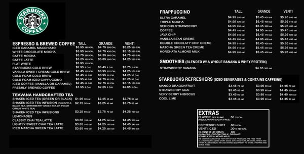
Starbucks uses the Decoy Effect well. In order to boost the appeal of their most expensive product, they have three sizes, with one price as a decoy.
This Nat Geo Brain Games popcorn experiment is another astonishing example:
People who came to the cinema couldn’t bring themselves to buy the large popcorn for $7 because it was too expensive, and would instead opt for the small popcorn at $3, when those were the only two options.
However,
When a decoy “middle popcorn” was introduced at $6.50, more people opted for the $7 popcorn because it was only “50 cents more expensive”.
Decoys are a good way to nudge your consumers to opt for a more expensive product in a subtle way (read how else you can use Thaler’s nudges here) .
Therefore,
Place the price of another item next to your best selling products to help drive purchase behavior.

Reframing the value can be a powerful psychological pricing technique if used correctly.
How you frame the price of a product/service will have a huge impact on whether a consumer will purchase it or not.
Imagine you are selling consumer software at $1,500 per year on an annual subscription. You may justify this price by presenting the products’ features and benefits, but often this will not be enough...
Not for me, anyway. That’s way too expensive!
Reframing this scenario may generate more sales:
Instead of “$1,500 per year” say, “$125 per month” or, even better, “$31 per week”.
Hm, now that seems more affordable.
Although not everyone is as bad at math as me, a smaller price is not only more persuasive and significantly easier for the consumer to rationalize,
But it’s also easier for their brain to process.
A neuro-imaging study published by Human Brain Mapping found that higher prices actually activate neural circuits involved with anticipating loss.
If you do offer annual plans (be it subscriptions or loyalty programs), divide the payments into installations or mention the daily equivalence of the price to break it down and promote cognitive fluency.
Another way to reframe the value of products on your web-store is through shipping.
People love free shipping, and will often add more products to their cart with the promise of this.
So, incorporate your shipping costs into the product prices so that come checkout, people don’t abandon their carts by seeing “+$5” as shipping costs.
Changing the designs of your numbers will help drive conversions.
Why?
People subconsciously respond to things in various, trackable ways. Here are a few ways to optimize your web-store pricing techniques by experimenting with number design.
Firstly, have you noticed how menus have gotten rid of the currency signs?
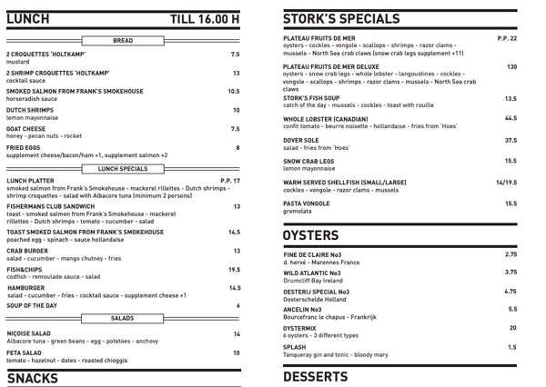
This makes the number seem smaller and also contributes to cognitive fluency.
Furthermore, according to psychologist Nick Kolenda, if you have large numbers, it’s important to be precise. The more rounded up zero’s a big number has, the more expensive it may look.
On the other hand, round up smaller numbers because these promote fluency.
For luxury items, product-and-then-price is usually an effective design to drive conversion.
For example,
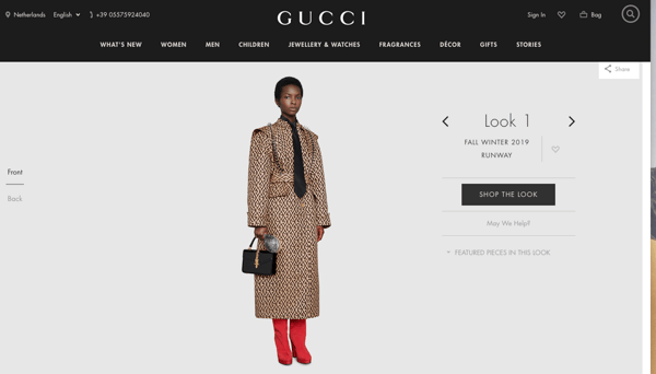
Gucci shows their prices very last after the shopper has been through “Shop the Look” and had an intimate exploration of the clothes before showcasing the price.
Another tactic for price design is related to Amazon.
On Amazon, prices are small at checkout, reducing the perception of paying for more. Additionally, the items are placed in a big white box with lots of empty space, mirroring an almost empty shopping cart.
This nudges people towards conversion and alleviates the stress of a full-capacity cart symbolizing more spending.
Use A/B Testing and (if more advanced in digital analytics maturity), multivariate testing, to see which persuasive pricing works best for which customers.
Experiment with different number designs to see what works, and also test different colors.
Did you know?
Women and men respond to colors in different ways whilst shopping online, so it’s important that you analyze your target audience before making any decisive design changes.
Although consumer psychology has a few general rules, your customers are unique and each comes to your shop for their own, personal reasons.
Acquire and analyze your customer data to better price your products.
So there you have it!
This article has covered what we believe are the top seven most effective psychological pricing techniques.
I think it’s safe to say that at least one of these techniques have not yet been implemented in your eCommerce platform but could positively boost your sales and drive customer engagement and interaction.
What are you waiting for?
Run controlled, small-scale tests to see what works and what doesn’t. This is the most cost effective and risk-friendly way to go about persuasive pricing.
There is no one size fits all answer here.
Different psychological pricing techniques will have fluctuating impacts depending on the country, market, or business you are operating within.
But it doesn’t hurt to test out different persuasive pricing techniques to see what works for you!
Good luck!