How do you master consumer behavior in eCommerce? You learn the FBM down to a T!
Behavior is complex. It is multi-faceted and challenging to predict with certainty. However, with the capabilities that technology and data give us today, we are given unprecedented opportunity to understand behavior on a deeper level.
In the past, when it came to studying human behavior, psychological and social studies were known to result in promising avenues of research and correlations. But, at the same time, they generally lacked external validity, making it difficult to transfer the findings to the “real world.”
Today, we find ourselves in a completely different situation. We now have the tools at our disposal to test hypotheses founded through empirical research in highly-trafficked platforms. With this opportunity to test real behavior, scientific models have adapted to meet the needs of the online environment.
Transition from old design methodology to new
Some time ago, we introduced the Elaboration Likelihood Model, one of the most frequently used theories in persuasive communication. But times change and so do the models that we use and apply to our needs.
During this transition to more practically relevant models, we’ve experienced the birth of the Fogg Behavior Model. BJ Fogg, the founder of the Stanford Persuasive Technology Lab, created this model with website UX in mind.

“My Behavior Model shows that three elements must converge at the same moment for a behavior to occur: Motivation, Ability, and Prompt. When a behavior does not occur, at least one of those three elements is missing.”
BJ Fogg
Using the FBM to identify obstacles to behavior
Sometimes, even with the best webshop design, shoppers don’t behave in the way you want or expect. The FBM helps behavioral designers and eCommerce managers identify the problem causing factors to create effective persuasive designs.
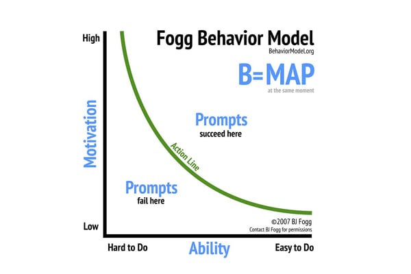
Fogg Behavior Model
The graph above shows that the optimal time for a prompt is when ability and motivation are high. Individuals who meet these requirements are highly motivated and able to complete a task, making them prime candidates for a behavior prompt.
But, naturally, these elements are not always perfectly aligned, which is why it’s important to try and improve the parts that are lacking.
Let’s look at these components of the model on their own.
Motivation
By the time someone ends up on your webshop, he or she will ideally already have the motivation needed to complete a purchase. I mean, they came to your site for a reason - right?
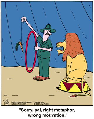
If not, it will be an uphill battle trying to increase motivation, as it's the most difficult element to change. But, there are ways in which motivation can be stimulated. For instance, through:
Sensation: Searching to experience pleasure or avoiding pain. These strong motivators are thought to be a primitive and immediate response to information.
Anticipation: Hoping that good things will happen or the fear that bad things will occur. These motivators relate to the anticipation of future events.
Belonging: The need to be socially accepted or resistance against being socially rejected. The desire to belong somewhere is overwhelming for humans, which motivates them to act in a certain way.
In this model, motivation is the primary driver of persuasion and, in turn, promoting desired behavior. You can see it as the emotional backdrop that consumers use to move through the online buyer’s journey.
Ability

The most influenceable element of this model is ability, as you can easily increase users’ ability by improving your webshop’s ease of use. With this, simplicity is essential. So when it comes to optimizing it, keep in mind how much of the following your target audience can or wants to expend on your webshop:
Time: The more straightforward a webshop is, the less time it takes to figure out. Most people don't want to spend an unnecessary amount of time on shopping online, so design accordingly.
Money: How much disposable income does your audience have? If they don’t have much, extra costs (like shipping or taxes not included in prices) may make your webshop more complex.
Physical Effort: Try to make actions take as little effort as possible. Remove barriers by enabling one-click shopping, auto-fill options, etc.
Brain Cycles: How hard do your shoppers have to think while on your site? Make the customer experience intuitive with clear copy, sizing option explanations, product details, and add-to-cart/checkout options.
Social Standard: People don’t want to go against the norm (even if it takes less effort). Try to understand what your target audience’s social standards are and provide peace of mind by conveying that their actions are in line with these.
Routine: Make the shopping experience feel as routine as possible. Meaning that the process of adding to cart, checking out, and paying should be intuitive and consistent across platforms.
Ultimately, you need to design every landing in a way that maximizes impact by making the customer’s journey seamless and intuitive.
Prompt
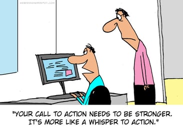
A prompt, otherwise known as a nudge, call-to-action, or cue, is an increasingly important feature of any website.
Unlike print or broadcast advertising, online prompts facilitate behavior with more ease by keeping the person wanting to perform the marketing-related action in the same context. Plus, because of personalization capabilities, prompts score significantly higher on relevance.
Prompts bring everything together by prompting desired behavior. While a person can have high ability and motivation, without a prompt they will not know how to complete the action they are seeking to do. With this, a well-thought-out prompt is the final piece to the online conversion puzzle.
Check out this blog post for an in-depth article on prompts (with 16 practical examples!).
Fogg outlines three types of prompts:
Spark: When motivation to perform a behavior is lacking, use the spark cue. Sparks prompt individuals by combining a motivator with a bold call-to-action.
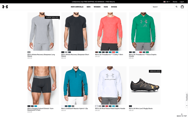
For example, many webshops use fear as a motivator through the use of scarcity. Scarce items are perceived to be of more value than those that are plentiful. So by adding a prompt highlighting the limited or exclusive nature influences people to act in fear of missing out.
Sparks can virtually combine any human cognitive bias (e.g., social proof, FOMO, price-sensitivity, etc.) with a well-phrased call-to-actions to prompt desired behavior.
Facilitator: This prompt is most appropriate for those who have high motivation but low ability. In this case, your web design usability comes to the forefront by highlighting its ease of use.
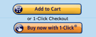
For example, provide one-Click Checkout options on your products to take away any obstacles one might face when crunched for time (or patience). Use facilitators to show how easy it is to reach the desired goal.
Signals: These prompts are best suited for those with both the ability and motivation to perform a target behavior. Signals merely serve as a reminder to do a task, like a calendar notification reminding you to water the plants.
These cues are less aggressive and lead the shopper to the next step in the buyer’s journey. Calls-to-action like “Add to Cart” or “Checkout” are prime examples of this.
.png?width=461&name=pasted%20image%200%20(1).png)
Creating a conversion-ready website with the FBM
Make sure that as you implement the takeaways from this model, you stay consistent in your messaging and design. Customers set expectations when they are exposed to your brand online and offline. Ensure that the standards are met (or exceeded) as you design your website.
Keep a close eye on your analytics to gauge which landing pages are succeeding as well as which are lagging behind. Heat map tools might also be a solution to finding those areas of improvement. But, most importantly, be sure to understand your customer’s expectations, motivations, and behavior.
The goal is to ultimately remove shoppers’ barriers to conversion. By providing a service and experience free of hiccups, these barriers will disappear.
This customer-centric approach will not only improve the UX for your customers. But you will benefit from an improved conversion rate. Just keep in mind, don’t go overboard with persuasion prompts. Shoppers are sharp, and they will catch on to any attempts to con them or blatant attempts of manipulation.
Run tests, collect feedback, (re)iterate. If done appropriately, all those involved come out with more satisfaction.
In short, keep the following in mind:
- Motivation, ability, and a prompt are needed to nudge desired behavior.
- Motivation is the most difficult to increase but can be encouraged by appealing to the users’ motivators (or cognitive biases).
- Ability can be best increased by making your site simple to use.
- Different prompts are needed for different situations, make sure you design with users’ motivation and ability in mind.
- Test, test, test!
