Having a wide range of products is often seen as a strength. However, when too many choices overwhelm shoppers, it can have the opposite effect.
Let’s say you are walking into a massive store filled with endless shelves of products. You came in to buy one thing, but now you are overwhelmed with similar options. You hesitate, second-guess yourself, and eventually walk out without making a purchase. This is choice paralysis in action, and in the digital world of eCommerce, it’s an even bigger problem than you could imagine.
Shoppers now demand personalization, as the perceived luxury of various choices has become more of a barrier than a benefit. So, how can reducing choice paralysis lead to success without sacrificing variety?
The answer lies in Guided Selling. We will explore how product discovery tools and AI-driven recommendations can remove friction and drive more conversions.
Understanding Choice Paralysis

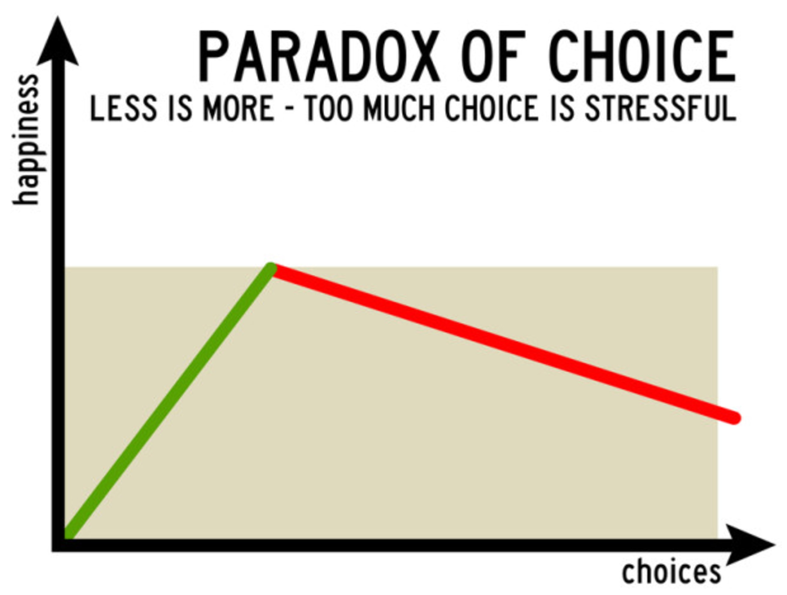
How overthinking decisions can hold shoppers back | Source
In eCommerce, having a wide range of products is often seen as a strength. However, when too many choices overwhelm shoppers, it can have the opposite effect. This phenomenon is known as choice paralysis, and it’s a major problem for brands aiming to convert site visitors into buyers.
What is Choice Paralysis?
Choice paralysis occurs when consumers face too many options, making it difficult for them to select a product confidently. Instead of feeling motivated by variety, customers become stuck in indecision, afraid of making the wrong choice. As a result, they delay their purchase or finish the buying process forever.
Psychologically, this happens because the human brain has a limited capacity for processing information. When faced with too many options, especially without clear guidance, shoppers experience cognitive overload, leading to a sense of frustration or anxiety.
Common Triggers of Choice Paralysis in eCommerce
Several factors contribute to choice paralysis in online shopping, making it harder for customers to reach a purchase decision. For example:
- Overwhelming Product Assortments – When an online store offers hundreds or even thousands of products without proper filters, comparisons, or guidance, customers struggle to identify the best option for their needs. Instead of feeling resolute, they feel lost.
- Lack of Relevant Information – If product descriptions are too generic, overly technical, or incomplete, shoppers are left guessing. Without clear details on features, benefits, or differentiators, they hesitate to proceed to a purchase.
- Too Many Similar Options – When multiple products appear identical or offer only subtle differences, consumers find it challenging to determine which one suits them best. This is especially common in categories like electronics, fashion, and beauty, where small variations in specifications or ingredients can be confusing.
- No Personalization or Guidance – Generic product listings force customers to figure things out on their own. Without tailored recommendations or interactive guidance, shoppers lack confidence in their decisions and may abandon their carts in search of a simpler experience elsewhere.
- Fear of Regret – With so many choices, shoppers worry about making the wrong decision and experiencing buyer’s regret. They may postpone their purchase or exit the site to "think about it," often never returning.
Reducing choice paralysis is a tricky challenge, so eCommerce brands should take strategic steps to overcome it in the decision-making process. The goal is not to eliminate choices but to present them in a way that simplifies the journey from start to finish.
Impact on Customer Experience & Conversions

Decision-making is a fundamental aspect of human existence | Source
When customers are faced with too many options and insufficient guidance, the overall customer experience is in trouble. Instead of moving confidently toward a purchase, they:
- Overthink Their Decision – The more options available, the more effort it takes to compare features, prices, and benefits. Without clear differentiation, customers struggle to make the right choice.
- Delay Their Purchase – If a shopper is unsure which product is the right fit, they will often leave the site, hoping to find a similar or better product. Many customers will never return to the store, meaning brands lose potential sales.
- Abandon Their Cart – A complicated decision-making process is bad for conversions. Shoppers either get frustrated and exit, or they decide to buy from a competitor with a smoother shopping experience.
- Choose Nothing at All – Many studies show that too many choices often result in no decision at all. When customers feel overwhelmed, they don’t take action by default, leading to missed conversion opportunities.
Now, let’s talk about conversions. When choice paralysis goes unnoticed, brands suffer from:
- Lower Conversion Rates – Customers who hesitate or get stuck in the decision-making process are less likely to complete their purchase. A huge, overwhelming catalog can lead to a sharp drop in conversions.
- Increased Bounce Rates – Without the right tools to simplify product selection, customers will leave the website quickly, seeking an easier shopping experience elsewhere.
- Higher Cart Abandonment – The lack of confidence in choosing the right product leads to shoppers adding items to their cart but never checking out. A confusing product selection process often results in abandoned carts.
- Customer Dissatisfaction & Lower Retention – Even if a customer makes a purchase, they might feel uncertain about their choice, leading to choice overload or product returns. Over time, this weakens brand loyalty.
Guided Selling as a Solution for Simple Product Discovery
Choice paralysis keeps customers away and leads to lost sales. Guided Selling offers a structured approach to help customers navigate complex eCommerce stores by steering them toward the right choice based on their needs and preferences. Instead of leaving consumers to dig through endless options, guided selling tools actively assist them in the decision-making process.
For better understanding, guided selling is actually a digital sales technique that uses interactive recommendations, quizzes, and AI-driven assistance to match customers with the best products for their needs. Think of it like an in-store salesperson, asking the right questions and filtering out irrelevant choices. By doing so, it eliminates guesswork and simplifies the product discovery process like nothing ever.
Guided Selling solutions are here to reduce choice paralysis and friction with:
- Personalized Recommendations: Guided selling tools collect key inputs from users (such as budget, preferences, or specific use cases) to filter options and present only the most relevant products.
Reducing Cognitive Load: Instead of forcing customers to evaluate every option, Guided Selling narrows choices based on logical and user-friendly steps. This makes decision-making faster and easier for everyone.
- Interactive and Engaging Shopping Journeys: There are no static product listings, as guided selling tools often prefer interactivity, such as quizzes, comparison charts, and chat-based recommendations, keeping customers engaged from start to finish.
- Optimizing for Different Shopping Behaviors: Some customers know exactly what they want, while others need assistance. Guided Selling adapts to different shopper needs as a modern selling approach, whether they prefer quick recommendations or a more detailed exploration.
The Psychology Behind Guided Selling

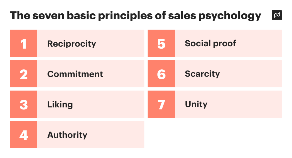
Understanding consumer psychology ensures retailers stay ahead of the competition | Source
We saw that product overload can lead to frustration, indecision, or even abandonment of the purchase when it comes to your customers. Guided Selling counteracts exactly this by using consumer psychology principles that make decision-making easier and more intuitive.
Reducing Cognitive Load
Cognitive load refers to the mental effort required to process information and make a decision. When a shopper encounters an overwhelming number of options, their brain struggles to analyze and compare each one, leading to fatigue and inaction. Guided Selling minimizes this by:
- Breaking Down Complex Choices: Guided Selling tools ask targeted questions and present only the most relevant options.
- Providing Clear, Step-by-Step Assistance: Shoppers are guided through a structured process that gradually narrows down choices, making the selection feel effortless rather than overwhelming.
- Eliminating Irrelevant Information: By focusing only on what matters to the individual user, Guided Selling prevents distractions and unnecessary comparisons.
Shoppers feel more confident when they receive recommendations based on their specific preferences rather than generic suggestions. By clearly explaining why a certain product is the best fit, guided selling reassures customers that they are making an informed decision. Just as an in-store salesperson asks questions to find the best product, you can replicate this experience with personalized online shopping, making customers feel valued and supported.
Case Study: How Best Buy Simplifies Product Selection
Best Buy, a leading electronics retailer, offers an extensive range of products, such as televisions, which can overwhelm customers and lead to choice paralysis. To fix this, Best Buy restructured its online product presentation and implemented:
- Curated Display: Featuring a limited selection of highlighted products on the main landing page to avoid overwhelming customers with too many options at once.
- Filtering Options: Providing intuitive filters (screen size, brand, price range, etc.) to help customers narrow down choices based on their preferences.
This structured approach allowed customers to efficiently find products that matched their needs without feeling overwhelmed by the full range of options. This is a clear example of a simple decision-making process, as Best Buy aimed to boost the shopping experience and reduce choice paralysis with no worries.
How Guided Selling Transforms Choice Overload into Confident Purchasing Decisions
To sum up, choice paralysis is a major roadblock in eCommerce, leading to frustration, indecision, and lost sales. When faced with too many options and too little guidance, customers either delay their purchase or abandon it forever. This is where Guided Selling makes all the difference.
With a simple decision-making process through interactive product advisors, smart filtering, and personalized recommendations, Guided Selling helps shoppers make confident choices, reducing choice paralysis. That’s how they feel valued and get tailored suggestions that are crucial to reduce cognitive load.
For eCommerce brands, implementing a guided selling solution like Crobox doesn’t just improve user experience but also boosts conversions, increases engagement, and builds trust. When shoppers feel guided rather than lost, they are far more likely to complete their purchase easily. If you want to transform choice overload into a flawless shopping experience, book a demo and see how Crobox’s Product Advisor can drive conversions and customer satisfaction on the go.

